Propensity Scores: Balancing the Scales in Causal AI
Advanced Statistics
Propensity Scores
A practical guide to propensity scores, overlap, matching, weighting, and balance diagnostics for causal analyses in observational data.
Published
December 1, 2025
Modified
June 9, 2026
Executive Summary
Observational data are tempting because they are abundant, practical, and often closer to real-world decision settings than tightly controlled experiments.
But they come with a major problem:
treatment groups are usually not comparable at baseline.
Patients who receive one therapy rather than another may differ in:
severity,
age,
comorbidity burden,
access to care,
clinician preference,
or site-level practice patterns.
Those differences can confound the treatment-outcome relationship.
This is where propensity score methods become useful.
A propensity score is the probability of receiving treatment given observed covariates. It compresses many confounders into a single balancing score that can be used to:
match treated and untreated patients,
weight observations,
or stratify the sample.
This post introduces:
estimating propensity scores,
matching,
weighting,
stratification,
overlap,
and covariate balance diagnostics,
using a healthcare-style comparative effectiveness example.
Propensity scores matter because in observational data, treatment groups rarely begin on equal footing, and causal analysis needs a way to rebalance the comparison. ## Propensity Scores Begin with the Confounding Problem
In a randomized experiment, treatment assignment is designed to be unrelated to the patient’s potential outcomes, at least in expectation.
In observational data, treatment assignment is usually not random.
It is shaped by real processes such as:
case mix,
severity,
access,
preference,
and clinician judgment.
That means the crude treatment comparison may reflect both:
the causal effect of treatment,
and baseline differences between who did and did not receive it.
Propensity score methods are designed to reduce that imbalance using observed covariates.
They do not solve unmeasured confounding, but they can help create a more comparable treated and untreated sample with respect to measured variables. ## The Propensity Score Is a Treatment Probability
Formally, the propensity score is:
[ e(X) = P(T = 1 X)]
where:
is treatment assignment,
is the vector of observed covariates.
This quantity matters because of a key result:
if treatment assignment is ignorable given the covariates, then it is also ignorable given the propensity score.
Rather than matching or adjusting on many covariates directly, the analyst can work through the probability of treatment conditional on those covariates.
That is the central simplification. ## A Healthcare-Style Example Makes the Problem Concrete
To illustrate, we will simulate an observational comparative effectiveness dataset in which sicker patients are more likely to receive treatment.
This is exactly the kind of setting where naïve comparisons can be misleading.
Even though treatment is beneficial in the data-generating process, the naïve estimate may be biased downward because the treated patients were sicker to begin with.
This is the confounding problem propensity score methods are trying to address. ## Logistic Regression Is a Common Way to Estimate Propensity Scores
A standard way to estimate propensity scores is logistic regression.
The treatment indicator is the outcome, and baseline covariates are the predictors.
This gives each observation a predicted probability of treatment given the measured covariates.
That probability becomes the basis for matching, weighting, or stratification. ## Overlap Is One of the Most Important Diagnostics
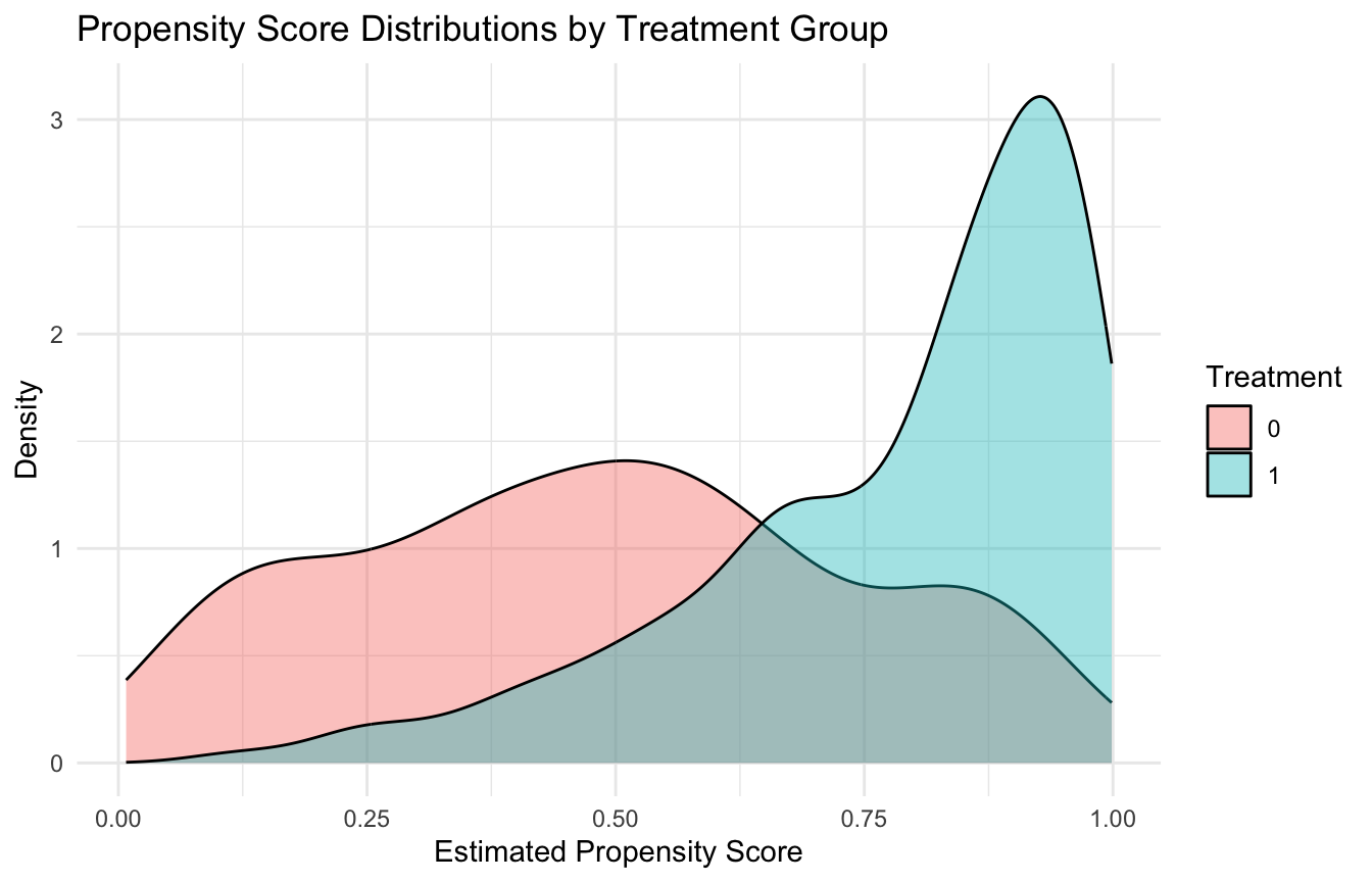
A crucial assumption in propensity score work is overlap, also called positivity.
This means that across the relevant covariate space, units should have a nonzero probability of receiving either treatment.
If treated and untreated groups occupy very different parts of the covariate space, then causal comparison becomes unstable or impossible in those regions.
A simple way to inspect overlap is to compare the propensity score distributions by treatment group.
Matching is often one of the most intuitive propensity score approaches because it tries to create a pseudo-cohort of comparable treated and untreated patients. ## Balance Matters More Than the Propensity Model’s Fit
A very important practical point is that the goal of the propensity model is not predictive excellence.
It is not about maximizing classification accuracy for treatment assignment.
The goal is covariate balance.
A propensity score model that predicts treatment extremely well may actually be a warning sign if it implies poor overlap. What matters most is whether, after using the scores, the treated and untreated groups become more similar in the covariates.
That is one reason propensity score work is different from ordinary predictive modeling.
The evaluation target is balance, not treatment prediction accuracy. ## Standardized Mean Differences Are the Core Balance Diagnostic
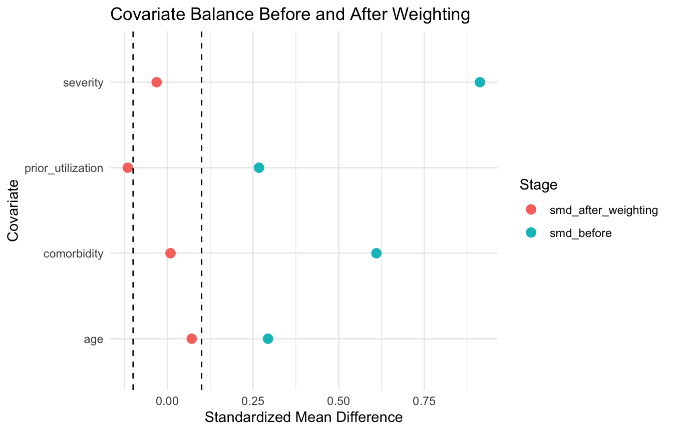
One of the most common balance diagnostics is the standardized mean difference (SMD)(Austin 2009, 2011).
For a continuous covariate, this summarizes the difference in group means relative to pooled variability.
ggplot2::ggplot(balance_plot_df, ggplot2::aes(x = smd, y = variable, color = stage)) + ggplot2::geom_point(size =3) + ggplot2::geom_vline(xintercept =c(-0.1, 0.1), linetype =2) + ggplot2::labs(title ="Covariate Balance Before and After Weighting",x ="Standardized Mean Difference",y ="Covariate",color ="Stage" ) + ggplot2::theme_minimal()
This kind of plot often communicates balance improvement much better than a table alone. ## Stratification Uses the Propensity Score to Form Comparable Subclasses
A third common approach is stratification, or subclassification.
The idea is to divide the sample into strata based on the propensity score, such as quintiles, and then compare treated and untreated outcomes within those strata.
If the propensity score is doing its job, units within a stratum should be more comparable in their observed covariates than the full raw sample.
and often easy to explain. ## Estimating the Effect After Weighting Is Straightforward
Once weights are available, the treatment effect can be estimated in a weighted outcome model.
fit_weighted <-lm(outcome ~ treatment, data = ps_df, weights = iptw)summary(fit_weighted)$coefficients
             Estimate Std. Error    t value     Pr(>|t|)
(Intercept) 37.096521  0.3088440 120.114124 0.000000e+00
treatment    2.898237  0.4436969   6.532021 1.154953e-10
This is one simple ATE-style estimate under IPTW.
In real applied work, analysts may prefer robust standard errors or more specialized weighted estimators, but the essential idea is the same:
first balance the groups,
then estimate the effect in the reweighted sample. ## Matching, Weighting, and Stratification Target Slightly Different Analytic Goals
These three methods are closely related, but they are not identical.
Matching
Often targets a matched comparison that may be closer to the ATT, depending on design.
Weighting
Often used to target the ATE or ATT, depending on the weights used.
Stratification
Provides a subclass-based approximation to adjusted comparison.
So the choice is not merely technical. It depends on:
the target estimand,
overlap quality,
sample size,
and interpretability needs.
That is why it is important to define the causal estimand clearly before choosing the method. ## Overlap Problems Can Make Propensity Methods Fragile
A major vulnerability in propensity score analysis is poor overlap.
If some patients are almost certain to be treated and others are almost certain not to be treated, then causal comparison in those regions becomes weak.
This can produce:
unstable weights,
poor matches,
and unreliable extrapolation.
That is why analysts sometimes:
trim extreme propensity scores,
restrict to regions of common support,
or report that the causal question is only answerable in the overlapping population.
This is not a minor detail. It is one of the most important limitations in observational causal work. ## Propensity Scores Only Balance Measured Confounders
One of the most important cautions is that propensity score methods do not solve unmeasured confounding.
They only adjust for variables that were:
measured,
included,
and modeled adequately.
That means a beautifully balanced matched or weighted sample can still be biased if an important confounder was omitted or poorly captured.
This is why causal claims from propensity score methods should always be paired with careful discussion of:
design,
covariate measurement quality,
and residual confounding risk.
Propensity scores are powerful tools, but they are not magic. ## Propensity Scores Now Integrate Naturally with ML Workflows
Modern causal ML often extends classical propensity score methods using flexible learners to estimate the treatment probability.
For example, instead of logistic regression, the propensity model might use:
random forests,
gradient boosting,
super learner,
or other ensemble approaches.
This can improve fit when treatment assignment is complex and nonlinear.
But the same principle remains:
the goal is balance, not prediction for its own sake.
This is why even when ML is used to estimate propensity scores, classical balance diagnostics still matter.
That is one of the strongest bridges between traditional causal inference and modern AI methods.
Trauma Registry Application: Propensity Scores for Comparative Effectiveness
Trauma registries are a natural setting for propensity score methods because treatment decisions are driven by patient severity, site capacity, and clinician judgment — not randomization.
Classic examples where propensity scores are used in trauma research:
Transfer decisions: patients transferred to Level I centers versus treated locally differ systematically in injury severity, distance, and resource availability.
Massive transfusion protocol (MTP): patients who receive MTP are already more severely injured — naïve comparisons confound treatment with severity.
Surgical timing: early versus delayed operative intervention is shaped by injury pattern, hemodynamic stability, and resource availability.
In each case, the propensity score compresses the confounding structure into a single balancing score (Rosenbaum and Rubin 1983), allowing matched or weighted comparisons that are more credible than crude group differences.
Balance diagnostics — especially SMDs before and after adjustment — are the standard of evidence that your comparison is defensible (Austin 2009).
A Practical Checklist for Applied Work
Before reporting a propensity score analysis, ask:
What is the causal estimand: ATE, ATT, or something else?
Which variables plausibly confound treatment and outcome?
Is the propensity model specified using only pre-treatment covariates?
Is there reasonable overlap between treatment groups?
Did matching, weighting, or stratification actually improve balance?
Are extreme weights or poor matches creating instability?
Could unmeasured confounding still materially bias the result?
These questions often matter more than whether the propensity score model itself “looks good.”
NoteWhere This Shows Up in AI/ML
MAVEN platform analyses comparing treatment protocols across military treatment facilities — massive transfusion ratios, tourniquet-to-OR time, resuscitative endovascular balloon of the aorta use — require propensity adjustment because patient selection into treatment reflects injury severity, not random assignment. An unadjusted comparison will show that the most aggressive interventions are associated with the worst outcomes, simply because they are applied to the most injured patients. Propensity score weighting reconstructs the pseudo-population in which treatment assignment is independent of measured severity covariates, making the comparison interpretable. The failure mode is balance checking: analysts who build a propensity model but never verify covariate balance after weighting have no evidence the adjustment worked.
Closing: Propensity Scores Help Rebuild Comparability in Observational Data
Propensity score methods remain central in causal inference because they offer a principled way to address one of the core problems of observational data:
treated and untreated groups are rarely comparable at baseline.
Matching builds more similar comparison groups. Weighting creates a pseudo-population with improved covariate balance. Stratification organizes comparison within propensity-defined subclasses.
All three methods aim at the same broader goal:
to make the observed comparison more closely resemble the counterfactual comparison we wish we had.
Propensity scores matter because causal inference in observational data is not only about modeling outcomes, but about restoring fairness to the treatment comparison before the outcome model is even trusted.
This post is part of the Causal Inference Toolkit — a companion reference with propensity score estimation templates, balance diagnostic code, IPTW scaffolds, and Love plot workflows for observational comparative effectiveness analyses.
Austin, Peter C. 2009. “Balance Diagnostics for Comparing the Distribution of Baseline Covariates Between Treatment Groups in Propensity-Score Matched Samples.”Statistics in Medicine 28 (25): 3083–107. https://doi.org/10.1002/sim.3697.
Austin, Peter C. 2011. “An Introduction to Propensity Score Methods for Reducing the Effects of Confounding in Observational Studies.”Multivariate Behavioral Research 46 (3): 399–424. https://doi.org/10.1080/00273171.2011.568786.
Rosenbaum, Paul R., and Donald B. Rubin. 1983. “The Central Role of the Propensity Score in Observational Studies for Causal Effects.”Biometrika 70 (1): 41–55. https://doi.org/10.1093/biomet/70.1.41.