Prediction & Rare Outcomes: Causation Confusion & Evaluation Under Imbalance

Trauma Registry Analytics — Lecture 4 of 5

Jonathan D. Stallings, PhD, MS

Data InDeed | dataindeed.org

2026-01-01

A model that predicts well proves nothing causal. A model evaluated only on AUC may be confidently wrong on every individual patient.

What You’ll Learn Today

Post 08 Prediction ≠ Causation

  • Two frameworks, one dataset
  • Why high R² proves nothing causal
  • DAGs before models
  • When each framework is right

Post 09 Evaluating Rare Outcomes

  • Accuracy trap revisited
  • AUC limitations at low prevalence
  • Calibration first
  • Decision curve analysis

Post 11 Rare Event Modeling

  • How rarity breaks otherwise good models
  • SMOTE: why and when to skip it
  • Preferred fixes
  • Evaluation that matches clinical reality

Part 1

Prediction ≠ Causation

Same data, different questions, different answers

Two Questions That Sound Identical

Prediction question:

“Given ISS, age, SBP, and mechanism — what is the probability this patient dies?”

Uses: triage support, risk stratification, resource allocation.

Model: optimized for discrimination and calibration.

Outcome: accurate probability estimate.

Causal question:

“If we administer TXA within 30 minutes — how much does mortality change?”

Uses: protocol development, CPG evaluation, policy.

Model: optimized for unconfounded effect estimate.

Outcome: valid causal estimate with uncertainty.

The dangerous error: Building a prediction model and then reading its coefficients as if they were causal effects. They are not — and acting on them as if they were can cause harm.

Why High Predictive Performance Proves Nothing Causal

n <- 600
# U = unmeasured confounder (frailty/reserve)
U   <- rnorm(n)
iss <- rnorm(n, 28, 10)
# Treatment: determined partly by U (sicker get more aggressive treatment)
trt <- rbinom(n, 1, plogis(-0.5 + 0.8*U))
# Outcome: U causes death; treatment helps
died <- rbinom(n, 1, plogis(-3 + 0.08*iss + 1.5*U - 1.2*trt))

# Prediction model: ISS + treatment → high AUC, wrong coefficient
pred_model <- glm(died ~ iss + trt, family=binomial)
pred_auc   <- as.numeric(auc(roc(died, fitted(pred_model), quiet=TRUE)))

# Causal model (if we had U): ISS + trt + U
causal_model <- glm(died ~ iss + trt + U, family=binomial)

tibble(
  Model   = c("Prediction (no U)", "Causal (with U)"),
  AUC     = c(round(pred_auc, 3), NA),
  `Coef(trt)` = round(c(coef(pred_model)["trt"],
                         coef(causal_model)["trt"]), 3),
  `True effect (log-OR)` = -1.2
)
# A tibble: 2 × 4
  Model                AUC `Coef(trt)` `True effect (log-OR)`
  <chr>              <dbl>       <dbl>                  <dbl>
1 Prediction (no U)  0.659      -0.449                   -1.2
2 Causal (with U)   NA          -1.37                    -1.2

The prediction model has good AUC but the treatment coefficient is severely biased — attenuated toward zero because U (unmeasured) both selects patients into treatment and predicts death. Using this coefficient to inform protocol would underestimate treatment benefit.

DAGs Before Models

Drawing the DAG first forces the question: what path am I trying to estimate? If your goal is the Treatment→Mortality arrow, you must control for U — which a prediction model does not require.

Part 2

Evaluating Rare Outcomes

Calibration first, discrimination second

The Accuracy Trap — Revisited for Trauma

n <- 2000; prev <- 0.04  # 4% mortality — typical DoDTR era rate

df_rare <- tibble(
  truth      = rbinom(n, 1, prev),
  pred_naive = 0,  # always predict survival
  pred_smart = rbinom(n, 1, plogis(-3.5 + rnorm(n, 0, 0.8)))
)

# Metrics for naive model
acc_naive  <- mean(df_rare$pred_naive == df_rare$truth)
sens_naive <- 0  # never catches a death

# Metrics for smart model
threshold  <- 0.08
pred_bin   <- as.integer(df_rare$pred_smart > 0)
tp <- sum(pred_bin == 1 & df_rare$truth == 1)
fp <- sum(pred_bin == 1 & df_rare$truth == 0)
fn <- sum(pred_bin == 0 & df_rare$truth == 1)
sens <- tp / (tp + fn)
ppv  <- tp / (tp + fp)

tibble(
  Metric = c("Accuracy", "Sensitivity (mortality detected)", "PPV (alert precision)"),
  `Naive model (predict all survive)` = c(acc_naive, 0, NA_real_),
  `Risk model` = c(mean(pred_bin == df_rare$truth), round(sens,3), round(ppv,3))
) |> mutate(across(where(is.numeric), ~round(.,3)))
# A tibble: 3 × 3
  Metric                           Naive model (predict all survi…¹ `Risk model`
  <chr>                                                       <dbl>        <dbl>
1 Accuracy                                                    0.955        0.919
2 Sensitivity (mortality detected)                            0            0.033
3 PPV (alert precision)                                      NA            0.038
# ℹ abbreviated name: ¹​`Naive model (predict all survive)`

At 4% prevalence: the naive model is 96% accurate. It catches zero deaths. Accuracy is catastrophically misleading for rare clinical outcomes.

Precision-Recall vs. ROC for Rare Outcomes

n <- 1000; prev <- 0.05
set.seed(55)
df_pr <- tibble(
  truth = rbinom(n, 1, prev),
  score = plogis(-3 + rnorm(n, 0, 1.5) + 2*truth)
)

# ROC curve
roc_obj <- roc(df_pr$truth, df_pr$score, quiet=TRUE)

# PR curve
thresholds <- seq(0.01, 0.99, by=0.01)
pr_df <- tibble(thresh=thresholds) |>
  mutate(
    pred = lapply(thresh, function(t) as.integer(df_pr$score > t)),
    tp   = sapply(pred, function(p) sum(p==1 & df_pr$truth==1)),
    fp   = sapply(pred, function(p) sum(p==1 & df_pr$truth==0)),
    fn   = sapply(pred, function(p) sum(p==0 & df_pr$truth==1)),
    prec = tp/(tp+fp+1e-9),
    rec  = tp/(tp+fn+1e-9)
  )

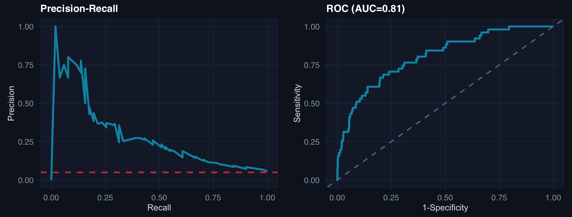
p1 <- ggplot(pr_df, aes(rec, prec)) +
  geom_line(color="#0891b2", linewidth=1.2) +
  geom_hline(yintercept=prev, linetype=2, color="#e63946") +
  labs(title="Precision-Recall", x="Recall", y="Precision") + theme_di()

p2 <- tibble(fpr=1-roc_obj$specificities, tpr=roc_obj$sensitivities) |>
  ggplot(aes(fpr, tpr)) +
  geom_line(color="#0891b2", linewidth=1.2) +
  geom_abline(linetype=2, color="#64748b") +
  labs(title=paste0("ROC (AUC=", round(auc(roc_obj),2),")"),
       x="1-Specificity", y="Sensitivity") + theme_di()

cowplot::plot_grid(p1, p2, ncol=2)

A PR curve at 5% prevalence quickly exposes the precision-recall tradeoff that ROC hides. At high recall (catching most deaths), precision may fall below the base rate — meaning most alerts are false alarms. That has operational consequences.

Part 3

Rare Event Modeling

Building models that don’t lie about risk

How Rarity Breaks Otherwise Good Models

n <- 3000; prev <- 0.03
df_re <- tibble(
  iss  = rnorm(n, 25, 10),
  age  = rnorm(n, 35, 14),
  died = rbinom(n, 1, plogis(-5 + 0.1*iss + 0.02*age))
)

# Standard logistic regression
fit <- glm(died ~ iss + age, data=df_re, family=binomial)
df_re$pred <- fitted(fit)

# Calibration plot
df_re |>
  mutate(decile=ntile(pred, 10)) |>
  group_by(decile) |>
  summarise(mean_pred=mean(pred), obs=mean(died), .groups="drop") |>
  ggplot(aes(mean_pred, obs)) +
  geom_abline(linetype=2, color="#64748b") +
  geom_point(size=5, color="#0891b2") +
  geom_line(color="#0891b2", linewidth=0.8) +
  scale_x_continuous(labels=scales::percent_format()) +
  scale_y_continuous(labels=scales::percent_format()) +
  labs(title="Calibration at 3% prevalence: standard logistic is often well-calibrated — check first",
       x="Mean predicted probability", y="Observed rate") +
  theme_di()

Check calibration before reaching for SMOTE or class weighting. Standard logistic regression is often better calibrated than complex resampling approaches. The calibration curve is the diagnostic — not the class distribution.

SMOTE: What It Does and Why to Skip It First

What SMOTE does: Creates synthetic minority-class samples by interpolating between existing rare-event observations.

Why analysts reach for it: The class imbalance “problem” looks solvable by rebalancing.

Why it often makes things worse:

  1. Interpolated synthetic patients aren’t real — they may be implausible
  2. Dramatically improves sensitivity at expense of catastrophic PPV loss
  3. Makes calibration worse: model learns from artificial distribution, deployed on real one
  4. Obscures the actual clinical tradeoff

Preferred fixes (in order):

  1. Calibration-first: Check if the model is already calibrated. Often it is.

  2. Threshold adjustment: Set threshold based on clinical cost asymmetry (missing a death >> false alert).

  3. Class weights: family=binomial, weights= in glm — shifts decision boundary without synthetic data.

  4. Bayesian priors: Regularize toward plausible prevalence.

  5. SMOTE last: Only if above don’t work, with extreme caution on calibration.

Evaluation That Matches Clinical Reality

# Decision curve analysis concept
n <- 1000; prev <- 0.05
df_dca <- tibble(
  truth = rbinom(n, 1, prev),
  score = plogis(-3.2 + rnorm(n, 0, 1.3) + 2.5*truth)
)

thresholds <- seq(0.01, 0.4, by=0.01)
dca_df <- tibble(threshold=thresholds) |>
  mutate(
    pred = lapply(threshold, function(t) as.integer(df_dca$score > t)),
    tp = sapply(pred, function(p) sum(p==1 & df_dca$truth==1) / n),
    fp = sapply(pred, function(p) sum(p==1 & df_dca$truth==0) / n),
    net_benefit = tp - fp * (threshold / (1-threshold)),
    all_positive = prev - (1-prev) * (threshold/(1-threshold))
  )

ggplot(dca_df, aes(threshold)) +
  geom_line(aes(y=net_benefit, color="Model"), linewidth=1.2) +
  geom_line(aes(y=all_positive, color="Treat all"), linewidth=1, linetype=2) +
  geom_hline(yintercept=0, color="#64748b", linewidth=0.5) +
  scale_color_manual(values=c("#0891b2","#e63946")) +
  scale_x_continuous(labels=scales::percent_format()) +
  labs(title="Decision curve analysis: net benefit of model vs. treat-all and treat-none",
       x="Decision threshold", y="Net benefit", color=NULL) +
  theme_di()

Decision curve analysis answers: “At what thresholds does using this model provide more net benefit than treating everyone — or no one?” This is a clinically grounded evaluation, not a purely statistical one.

Lecture 4 — Key Takeaways

Prediction ≠ Causation

  • Same dataset, different estimands — require different models
  • Prediction coefficient ≠ causal effect when unmeasured confounders exist
  • Draw the DAG before writing the model
  • Use prediction for triage; use causal inference for policy

Rare Outcomes

  • Accuracy is useless at 3–5% prevalence
  • AUC can look good while calibration fails
  • Precision-Recall exposes what ROC hides
  • Report at clinically decision-relevant thresholds

Rare Event Modeling

  • Calibration check first — often the model is fine
  • Threshold adjustment is the most defensible first step
  • SMOTE improves sensitivity, destroys calibration and PPV
  • Decision curve analysis: net benefit at clinical thresholds

The meta-lesson: Rare outcomes are not a modeling problem. They are a clinical reality. The model’s job is to accurately represent that reality — not to make the class distribution look balanced in a confusion matrix.

Coming Up: Lecture 5

Production & Governance: CDS Design, Calibration Drift & Audit-Ready Bayesian Workflows

Posts 10, 12 & 13:

  • Reliable clinical decision support — CDS as a system, thresholds as values, auditability by design
  • Calibration under drift — how models become confident and wrong, SPC-based monitoring
  • Audit-ready Bayesian workflows — prior justification, posterior provenance, governance