n <- 1000; prev <- 0.08
df_thresh <- tibble(
  truth = rbinom(n, 1, prev),
  score = plogis(-2.8 + rnorm(n, 0, 1.2) + 2.2*truth)
)

thresholds <- seq(0.03, 0.5, by=0.01)
thresh_df  <- tibble(t=thresholds) |>
  mutate(
    pred = lapply(t, function(th) as.integer(df_thresh$score > th)),
    sens = sapply(pred, function(p) sum(p==1 & df_thresh$truth==1) / sum(df_thresh$truth==1)),
    spec = sapply(pred, function(p) sum(p==0 & df_thresh$truth==0) / sum(df_thresh$truth==0)),
    ppv  = sapply(pred, function(p) {
      tp <- sum(p==1 & df_thresh$truth==1)
      fp <- sum(p==1 & df_thresh$truth==0)
      ifelse(tp+fp>0, tp/(tp+fp), NA)
    })
  )

thresh_df |>
  pivot_longer(c(sens, spec, ppv)) |>
  mutate(name=recode(name, sens="Sensitivity (miss cost)",
                     spec="Specificity (false alert cost)",
                     ppv="PPV (alert precision)")) |>
  ggplot(aes(t, value, color=name)) +
  geom_line(linewidth=1.1) +
  geom_vline(xintercept=0.10, linetype=2, color="#f59e0b") +
  scale_color_manual(values=c("#e63946","#0891b2","#f59e0b")) +
  scale_x_continuous(labels=scales::percent_format()) +
  scale_y_continuous(labels=scales::percent_format()) +
  annotate("text", x=0.12, y=0.95, label="Clinical\nthreshold", color="#f59e0b", size=3) +
  labs(title="Threshold choice: moving right improves PPV but misses more true deaths",
       x="Decision threshold", y=NULL, color=NULL) +
theme_di()Production & Governance: CDS Design, Calibration Drift & Bayesian Audit Trails
Trauma Registry Analytics — Lecture 5 of 5
2026-01-01
Thresholds Encode Values — Own Them
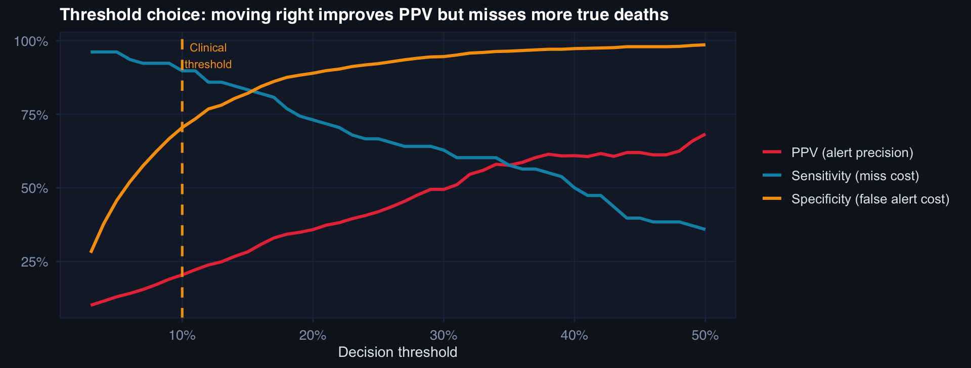
Choosing a threshold is an ethical decision about the relative cost of missing a death vs. generating a false alert. This must be made by clinicians and commanders — not set at 0.50 by default.
AUC Stable, Calibration Failing
# Simulate: model trained on pre-2022 data, deployed through 2025
# ISS distribution shifts upward; care quality improves
n_months <- 36; change_pt <- 18

monthly <- tibble(month=1:n_months) |> mutate(
  iss_mean = 25 + 0.2*month,
  care_eff = -0.01*month,
  # True mortality improving despite rising ISS
  true_mort = plogis(-3 + 0.08*iss_mean + care_eff),
  # Model was trained at month 1 conditions — doesn't know about improvement
  model_pred = plogis(-3 + 0.08*iss_mean),  # no care_eff term
  calibration_error = model_pred - true_mort
)

p1 <- ggplot(monthly, aes(month, true_mort)) +
  geom_line(aes(color="True mortality"), linewidth=1.1) +
  geom_line(aes(y=model_pred, color="Model prediction"), linewidth=1.1, linetype=2) +
  scale_color_manual(values=c("#0891b2","#e63946")) +
  labs(title="Model overpredicts mortality as care improves", y="Mortality rate", color=NULL) +
  theme_di()

p2 <- ggplot(monthly, aes(month, calibration_error)) +
  geom_col(fill="#e63946", alpha=0.7) +
  geom_hline(yintercept=0, color="#94a3b8") +
  labs(title="Calibration error grows monotonically", y="Predicted − True", x=NULL) +
  theme_di()

cowplot::plot_grid(p1, p2, ncol=2)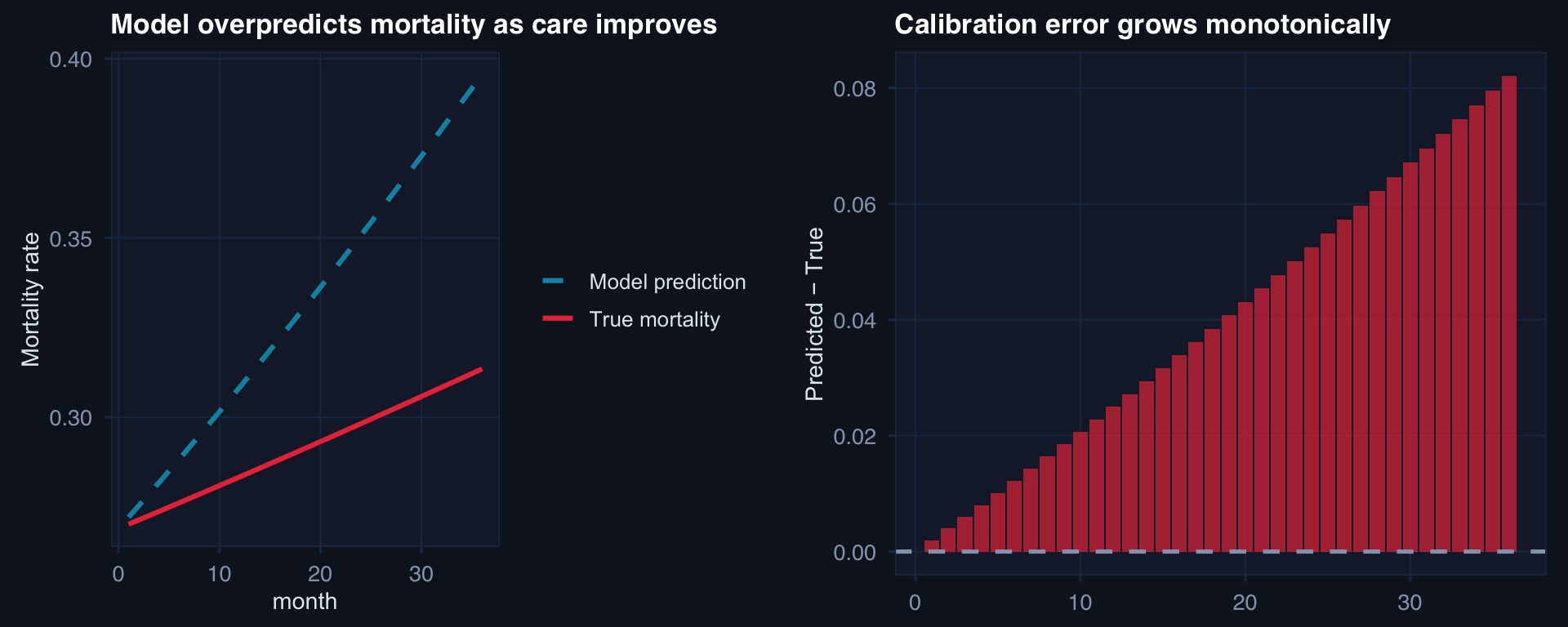
The danger: AUROC may remain high (the model still ranks patients correctly by relative risk) while calibration degrades (the absolute risk estimates become systematically wrong). A model predicting 25% mortality when true risk is 12% will trigger too many aggressive interventions.
SPC-Based Calibration Monitoring
# Monthly O/E ratio monitoring with control limits
set.seed(77)
n_mo <- 30
oe_ratios <- c(
  rnorm(18, 1.0, 0.12),   # in control
  rnorm(12, 1.28, 0.10)   # drift begins at month 19
)

center <- mean(oe_ratios[1:18])
sd_ic  <- sd(oe_ratios[1:18])
ucl    <- center + 3*sd_ic
lcl    <- max(0, center - 3*sd_ic)

tibble(month=1:n_mo, oe=oe_ratios) |>
  mutate(flag = oe > ucl | oe < lcl) |>
  ggplot(aes(month, oe)) +
  geom_hline(yintercept=c(lcl, center, ucl),
             color=c("#253554","#94a3b8","#253554"), linewidth=c(0.8,1,0.8),
             linetype=c(2,1,2)) +
  geom_line(color="#0891b2", linewidth=0.8) +
  geom_point(aes(color=flag), size=3) +
  annotate("text", x=28, y=ucl+0.02, label="UCL", color="#64748b", size=3) +
  annotate("text", x=28, y=center+0.02, label="Center", color="#94a3b8", size=3) +
  scale_color_manual(values=c("#0891b2","#e63946")) +
  geom_vline(xintercept=18.5, linetype=3, color="#f59e0b") +
  annotate("text", x=19.5, y=1.45, label="Drift\nbegins", color="#f59e0b", size=3) +
  labs(title="O/E ratio SPC chart: control limits from in-control period, signal = 3σ breach",
       x="Month", y="Observed/Expected mortality ratio") +
  theme_di() + theme(legend.position="none")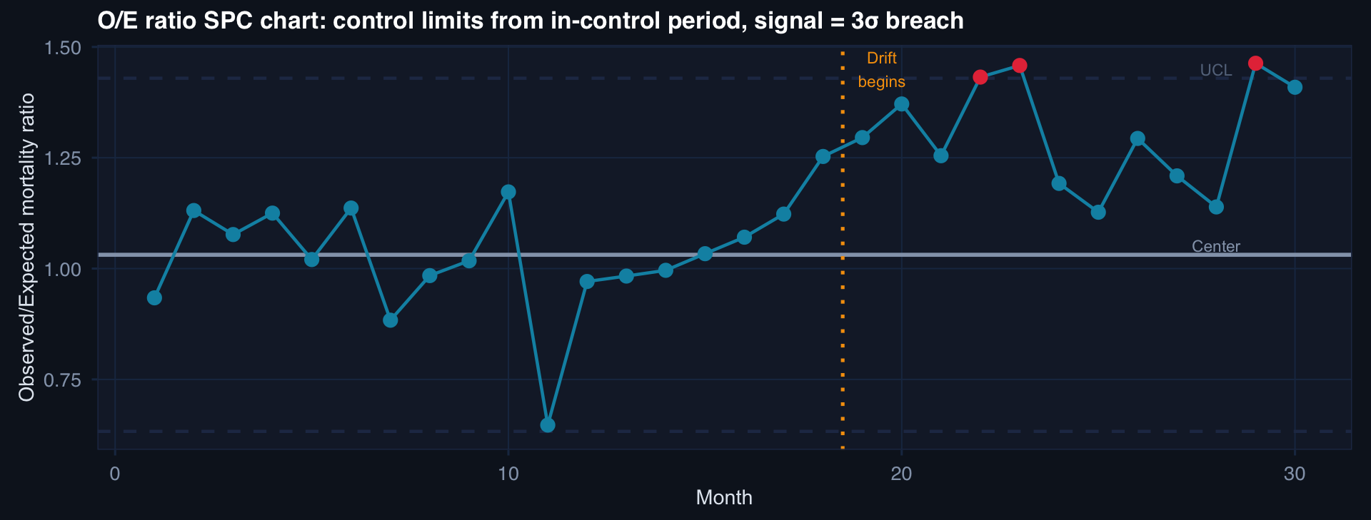
Observed/Expected (O/E) ratio = 1.0 means perfect calibration. O/E > 1 means model underpredicts; O/E < 1 means overpredicts. SPC control limits trigger review when the ratio drifts beyond 3σ.
Governance: Bayesian Models in Production
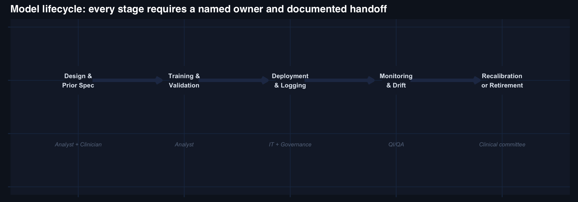
The governance questions that must be answered before deployment:
- Who owns this model?
- Who approves changes to the threshold?
- What triggers a recalibration review?
- What criteria trigger model retirement?
- Who receives the monthly O/E report?
If any of these are unanswered, the model is not ready to deploy — regardless of its AUC.