A practical guide to the curse of dimensionality, PCA, t-SNE, UMAP, and the challenges of distance, sparsity, and overfitting in high-dimensional data.
Published
June 15, 2025
Modified
June 9, 2026
Executive Summary
High-dimensional data promise rich signal, but they also create serious problems.
As the number of variables grows, data become harder to visualize, harder to model, and often harder to interpret. Distances become less informative. Sparse regions dominate the feature space. Models become more vulnerable to overfitting. Computation becomes heavier.
Dimensionality reduction matters because more variables do not automatically mean more useful information, and high-dimensional spaces often contain less usable structure than they appear to.
The Curse of Dimensionality Is a Geometry Problem
The phrase “curse of dimensionality” sounds dramatic, but the core issue is geometric.
As the number of dimensions increases:
points become farther apart,
the volume of the space grows rapidly,
and observations occupy a vanishingly sparse subset of the possible space.
That matters because many statistical and ML methods depend on meaningful notions of neighborhood, distance, and local structure.
In low dimensions, nearby points are often genuinely informative. In high dimensions, the concept of “nearby” can become much less useful.
This is one reason why methods that work well in small-feature problems can degrade badly in very high-dimensional settings.
Sparsity Is One of the Main Symptoms of High Dimension
A useful way to understand the curse is through sparsity.
Suppose you want to cover a one-dimensional interval with a modest number of points. That is manageable.
Now imagine covering a two-dimensional square with comparable density. You need many more points.
Now imagine ten dimensions. Or one hundred. Or ten thousand.
The number of observations required to densely populate the feature space explodes.
That is why high-dimensional datasets are often “large” in rows but still sparse in space.
This is especially important in genomics and omics data, where the number of features can be enormous relative to the number of subjects.
Distance Becomes Less Informative in High Dimensions
Many algorithms rely on distance:
K-nearest neighbors,
clustering,
manifold learning,
kernel methods,
and local smoothing approaches.
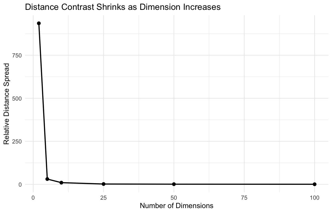
But in high-dimensional settings, distances often become less discriminating.
One way to say this is:
the difference between the nearest point and the farthest point can shrink relative to the scale of the space.
That means neighborhood-based reasoning becomes less stable.
We can illustrate this with a simple simulation.
library(dplyr)library(tibble)library(ggplot2)distance_spread <-function(p, n =300) { x <-matrix(runif(n * p), nrow = n, ncol = p) d <-dist(x) tibble::tibble(p = p,min_dist =min(d),mean_dist =mean(d),max_dist =max(d),ratio = (max(d) -min(d)) /min(d) )}dist_df <- dplyr::bind_rows(distance_spread(2),distance_spread(5),distance_spread(10),distance_spread(25),distance_spread(50),distance_spread(100))dist_df
A common mistake is to treat PCA, t-SNE, and UMAP as interchangeable.
They are not.
PCA
Best for:
linear reduction,
variance explanation,
denoising,
and stable preprocessing.
t-SNE
Best for:
local structure visualization,
showing possible subgroup separation,
and exploratory plots.
UMAP
Best for:
flexible nonlinear visualization,
local neighborhood preservation,
and often more coherent large-scale structure than t-SNE.
So the choice depends on the goal.
The question is not “which is best?” It is “best for what?”
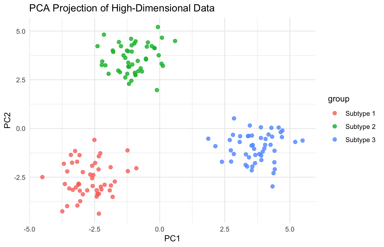
Embeddings Are Useful for Visualization, but Should Be Interpreted Carefully
Low-dimensional embeddings can be visually powerful, but they are not literal truth maps.
Important cautions:
distances in 2D may not reflect true high-dimensional distances exactly,
apparent clusters may depend on tuning parameters,
global geometry can be distorted,
and embeddings are often best viewed as exploratory summaries, not definitive structure proofs.
This is especially important in biomedical settings, where a nice embedding plot can tempt people to overclaim subtype separation.
A beautiful plot is not the same as a validated discovery.
Dimensionality Reduction Can Help Downstream Prediction Too
Reduction is not only about visualization.
It can also help with modeling by:
removing noise,
compressing correlated features,
reducing overfitting risk,
speeding training,
and improving numerical stability.
For example, PCA scores can be used as inputs into later predictive models.
This can be helpful when:
the original feature set is very large,
multicollinearity is strong,
and the analyst wants a more compact representation.
That said, unsupervised reductions do not always maximize predictive performance. They reduce dimension based on structure, not necessarily based on the target.
The Curse of Dimensionality Also Affects Neighborhood Methods
Methods such as:
K-nearest neighbors,
density estimation,
local regression,
and manifold-based clustering
often struggle in high dimensions because neighborhoods become less meaningful.
This is one reason dimensionality reduction can be useful before applying certain algorithms.
By projecting data into a lower-dimensional representation that preserves useful structure, the analyst can make local relationships more interpretable and more computationally manageable.
This is a major practical reason why reduction techniques remain important in real ML pipelines.
Feature Selection and Dimensionality Reduction Are Not the Same
It is helpful to distinguish two strategies:
Feature selection
Choose a subset of the original variables.
Dimensionality reduction
Construct new variables that summarize the original feature space.
Reduction methods like PCA, t-SNE, and UMAP do not choose existing variables. They create new coordinates.
This matters because interpretability differs.
Feature selection preserves the original variables. Dimensionality reduction often gains compression at the cost of direct variable-level meaning.
Both approaches are useful, but they solve different problems.
High-Dimensional Data Often Need Multiple Responses at Once
In practice, analysts often respond to the curse of dimensionality with a combination of methods:
feature screening,
regularization,
PCA or other reduction,
cross-validation,
and strong visualization discipline.
No single tool eliminates the curse.
Instead, good analysis usually involves reducing complexity from several angles at once.
That is especially true in genomics and other high-dimensional biomedical problems where the number of features can vastly exceed the number of observations.
A Side-by-Side Comparison Helps Build Intuition
A useful workflow is to compare multiple embeddings on the same dataset.
For example:
PCA for a stable linear view,
t-SNE for local clustering structure,
UMAP for a more flexible manifold-like representation.
This lets the analyst ask:
are the same broad groups appearing repeatedly?
or is the structure highly method-dependent?
Repeated structure across multiple methods is often more persuasive than one dramatic plot from one embedding.
That is a useful practical habit in exploratory high-dimensional analysis.
Reduction Methods Are Powerful, but Not Free
Dimensionality reduction can help, but it also changes the representation of the data.
That means some information is inevitably lost or distorted.
Questions to consider include:
what structure is being preserved?
what structure is being sacrificed?
is the new space interpretable enough for the goal?
will the embedding remain stable across tuning choices or reruns?
These are not reasons to avoid reduction. They are reasons to use it thoughtfully.
A Practical Checklist for Applied Work
Before using dimensionality reduction, ask:
Is the feature space large enough that sparsity is a real concern?
Is the goal visualization, denoising, compression, or prediction?
Are variables scaled appropriately first?
Is PCA a sufficient baseline before moving to nonlinear methods?
Does the embedding look stable across methods or tuning settings?
Am I interpreting a 2D plot too literally?
Should reduction be paired with regularization or feature selection?
Does the reduced representation help the downstream task in a measurable way?
These questions usually improve both rigor and interpretation.
NoteWhere This Shows Up in AI/ML
EHR-based clinical prediction models at large academic medical centers routinely begin with 5,000 to 50,000 candidate features — ICD codes, CPT codes, lab values, vital sign trends, medication administrations — and naive models trained on all available variables without regularization or dimensionality reduction produce AUCs that collapse by 10–20 points when deployed at a different institution. In trauma registry analytics, DoDTR records can include hundreds of injury descriptor fields, device fields, and procedure codes, most of which are near-zero in any given patient encounter; the curse of dimensionality means that distance-based clustering of injury patterns in this raw feature space is effectively meaningless without prior reduction. When a model developer reports strong development performance on a high-dimensional feature set without showing a regularized or reduced-dimension ablation, the audience should ask whether the model learned signal or learned the specific noise of one data collection environment.
Closing: The Curse Is Real, but So Are the Tools for Managing It
The curse of dimensionality remains one of the central challenges in modern statistics and machine learning because high-dimensional spaces are sparse, unstable, and hard to reason about directly.
But that does not mean analysts are helpless.
Dimensionality reduction provides practical ways to:
compress structure,
improve visualization,
reduce noise,
and create more manageable representations of complex data.
PCA gives a strong linear baseline. t-SNE reveals local neighborhoods. UMAP often gives flexible and useful embeddings for exploratory work.
Dimensionality reduction matters because when the feature space becomes too large to reason about directly, the smartest move is often not to model harder, but to represent the data better first.
This post is part of the Prediction Modeling Toolkit — a companion reference with dimensionality reduction templates, t-SNE and UMAP scaffolds, and high-dimensional data diagnostic tools for clinical modeling.
Bellman, Richard. 1957. Dynamic Programming. Princeton University Press.
Hastie, Trevor, Robert Tibshirani, and Jerome Friedman. 2009. The Elements of Statistical Learning: Data Mining, Inference, and Prediction. 2nd ed. Springer.
Jolliffe, Ian T. 2002. Principal Component Analysis. 2nd ed. Springer.
Maaten, Laurens van der, and Geoffrey Hinton. 2008. “Visualizing Data Using t-SNE.”Journal of Machine Learning Research 9: 2579–605.
McInnes, Leland, John Healy, and James Melville. 2018. “UMAP: Uniform Manifold Approximation and Projection for Dimension Reduction.”arXiv. https://arxiv.org/abs/1802.03426.