Causal Inference: Potential Outcomes & Propensity Scores

Advanced Statistics for AI & Clinical Decision-Making — Lecture 2 of 4

Jonathan D. Stallings, PhD, MS

Data InDeed | dataindeed.org

2026-01-01

Correlation tells you what happened together. Causation tells you what would happen if you intervened.

What You’ll Learn Today

Post 04 — Causal Inference Foundations

  • The fundamental problem of causal inference
  • Rubin’s potential outcomes framework
  • ATE, ATT — what are we actually estimating?
  • Why observational data breaks the easy comparison
  • Confounding as assignment mechanism bias

Post 05 — Propensity Scores

  • The propensity score theorem
  • Overlap and positivity
  • Matching vs. weighting vs. stratification
  • Balance diagnostics (SMD, Love plots)
  • Limitations: unmeasured confounding

Part 1

The Potential Outcomes Framework

Every causal question is a counterfactual question

The Fundamental Problem of Causal Inference

For each patient \(i\), define:

  • \(Y_i(1)\) = outcome if treated
  • \(Y_i(0)\) = outcome if untreated

Individual causal effect: \(\tau_i = Y_i(1) - Y_i(0)\)

We observe only one. The other is the counterfactual.

What we want:

\[\text{ATE} = E[Y(1) - Y(0)] = E[Y(1)] - E[Y(0)]\]

What observational data gives us:

\[E[Y \mid A=1] - E[Y \mid A=0]\]

These are not the same when treatment assignment is related to the outcome.

Trauma example:

Damage control surgery (DCS) vs. definitive surgery.

Sicker patients receive DCS. Naive comparison: DCS patients have worse outcomes.

Is that DCS’s effect — or just selection of sicker patients into DCS?

Randomization Solves the Problem

n <- 500
# Simulated confounder: severity
severity <- rnorm(n, 0, 1)

# RCT: treatment assigned independently
trt_rct  <- rbinom(n, 1, 0.5)
y_rct    <- 10 - 2*trt_rct + 1.5*severity + rnorm(n, 0, 2)

# Observational: treatment correlated with severity
trt_obs  <- rbinom(n, 1, plogis(-1 + 2*severity))
y_obs    <- 10 - 2*trt_obs + 1.5*severity + rnorm(n, 0, 2)

# Naive estimates
naive_rct <- coef(lm(y_rct ~ trt_rct))["trt_rct"]
naive_obs <- coef(lm(y_obs ~ trt_obs))["trt_obs"]
adj_obs   <- coef(lm(y_obs ~ trt_obs + severity))["trt_obs"]

tibble(
  Estimator    = c("RCT (naive)", "Observational (naive)", "Observational (adjusted)"),
  Estimate     = round(c(naive_rct, naive_obs, adj_obs), 3),
  `True ATE`   = -2
)
# A tibble: 3 × 3
  Estimator                Estimate `True ATE`
  <chr>                       <dbl>      <dbl>
1 RCT (naive)                -2.04          -2
2 Observational (naive)      -0.165         -2
3 Observational (adjusted)   -1.83          -2

Randomization makes \(E[Y(0) \mid A=1] = E[Y(0) \mid A=0]\) — the groups are comparable on everything, observed and unobserved. Observational data breaks this. Adjustment recovers it — but only for measured confounders.

The Three Estimands

Estimand Definition Clinical translation
ATE \(E[Y(1) - Y(0)]\) Population-average effect if everyone were treated vs. no one
ATT \(E[Y(1) - Y(0) \mid A=1]\) Effect in those who actually received treatment
ATU \(E[Y(1) - Y(0) \mid A=0]\) Effect if untreated patients had been treated

Which estimand to use: For policy decisions (“should we change the protocol?”) → ATE. For understanding current practice (“does DCS help the patients who get it?”) → ATT. Propensity score matching estimates ATT. Weighting (IPTW) estimates ATE.

Part 2

Propensity Scores

Balancing treatment groups on observed covariates

The Propensity Score Theorem

\[e(X) = P(A=1 \mid X)\]

Rosenbaum & Rubin (1983): If treatment is unconfounded given \(X\), it is also unconfounded given \(e(X)\) alone.

Dimension reduction: balance on 1 score instead of all \(p\) covariates.

Key assumptions required: 1. Unconfoundedness (ignorability): \(Y(a) \perp A \mid X\) — no unmeasured confounders 2. Positivity (overlap): \(0 < e(X) < 1\) — every patient could plausibly receive either treatment 3. SUTVA: stable unit treatment value assumption — one version of treatment, no interference

Estimating the Propensity Score

n <- 600
df_ps <- tibble(
  age      = rnorm(n, 38, 14),
  iss      = rnorm(n, 28, 12),
  sbp      = rnorm(n, 108, 24),
  mechanism = rbinom(n, 1, 0.45)  # penetrating vs blunt
) |> mutate(
  # Treatment (DCS) more likely for high ISS, low SBP
  ps_true  = plogis(-1.5 + 0.06*iss - 0.015*sbp + 0.4*mechanism),
  treated  = rbinom(n, 1, ps_true),
  ps_hat   = predict(glm(treated ~ age + iss + sbp + mechanism,
                         family=binomial), type="response")
)

# Overlap plot
df_ps |>
  mutate(Group = ifelse(treated==1, "Treated (DCS)", "Control (Definitive)")) |>
  ggplot(aes(ps_hat, fill=Group, color=Group)) +
  geom_density(alpha=0.4, linewidth=0.8) +
  scale_fill_manual(values=c("#2563eb","#e63946")) +
  scale_color_manual(values=c("#2563eb","#e63946")) +
  labs(title="Propensity score overlap — are distributions compatible?",
       x="Estimated propensity score P(DCS | X)", y="Density", fill=NULL, color=NULL) +
  theme_di()

Good overlap: distributions overlap across most of [0,1]. Poor overlap: groups are completely separated → positivity violated, estimates unreliable in the non-overlapping region.

Balance Diagnostics: SMD Before vs. After Weighting

# IPTW weights
df_ps <- df_ps |> mutate(
  iptw = ifelse(treated==1, 1/ps_hat, 1/(1-ps_hat))
)

# Compute SMD before and after
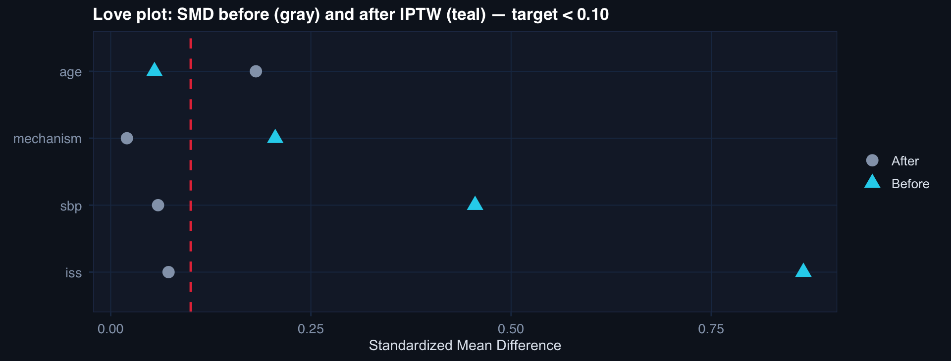
smd <- function(x, trt, w=NULL) {
  if (is.null(w)) w <- rep(1, length(x))
  m1 <- weighted.mean(x[trt==1], w[trt==1])
  m0 <- weighted.mean(x[trt==0], w[trt==0])
  s  <- sqrt((var(x[trt==1]) + var(x[trt==0]))/2)
  abs(m1 - m0) / s
}

vars <- c("age","iss","sbp","mechanism")
before <- sapply(vars, function(v) smd(df_ps[[v]], df_ps$treated))
after  <- sapply(vars, function(v) smd(df_ps[[v]], df_ps$treated, df_ps$iptw))

smd_wide <- tibble(Variable=vars, Before=before, After=after)
smd_wide |>
  pivot_longer(-Variable) |>
  left_join(select(smd_wide, Variable, Before), by="Variable") |>
  ggplot(aes(value, reorder(Variable, -Before), color=name, shape=name)) +
  geom_point(size=4) +
  geom_vline(xintercept=0.1, linetype=2, color="#e63946") +
  scale_color_manual(values=c("#94a3b8","#22d3ee")) +
  labs(title="Love plot: SMD before (gray) and after IPTW (teal) — target < 0.10",
       x="Standardized Mean Difference", y=NULL, color=NULL, shape=NULL) +
  theme_di()

SMD < 0.1 is the conventional balance threshold. After IPTW, all variables are well-balanced — the groups are now comparable on measured confounders.

Matching vs. Weighting vs. Stratification

Method Estimand Strengths Weaknesses
Matching ATT Transparent, interpretable Loses unmatched controls
IPTW ATE Uses all data Extreme weights → variance inflation
Trimmed IPTW Approximate ATE Stabilizes variance Some estimand ambiguity
Stratification ATE Simple, robust Residual confounding within strata

Registry practice: IPTW with stabilized weights is the workhorse for comparative effectiveness in trauma registries. Stabilized weights \(= \frac{P(A)}{e(X)}\) cap extreme values and reduce variance. Always trim weights > 99th percentile and check sensitivity to trimming threshold.

The Limitation That Cannot Be Engineered Away

Propensity scores only balance measured confounders.

If an unmeasured variable determines both treatment and outcome, propensity score methods cannot remove the bias — no matter how well the model fits.

E-value approach (Ding & VanderWeele): For a risk ratio of RR, the minimum unmeasured confounding strength needed to explain away the result is:

\[\text{E-value} = \text{RR} + \sqrt{\text{RR} \cdot (\text{RR} - 1)}\]

A large E-value means strong robustness. A small E-value means a modest unmeasured confounder could explain the entire result.

Lecture 2 — Key Takeaways

Potential Outcomes

  • Every causal question is a counterfactual question
  • ATE vs. ATT — choose before analysis, not after
  • Randomization solves the fundamental problem; observational data requires assumptions
  • Adjustment works only for measured confounders

Propensity Scores

  • \(e(X) = P(A=1 \mid X)\) — logistic regression is standard
  • Matching → ATT; IPTW → ATE

Diagnostics That Cannot Be Skipped

  • Overlap plot — positivity check
  • Love plot (SMD) — balance check
  • SMD < 0.10 after weighting is the target
  • Sensitivity to weight trimming

The meta-lesson: Propensity scores are a tool for making observational data less wrong — not for making it equivalent to a randomized trial. Know the assumptions. Report them. Quantify sensitivity.

Coming Up: Lecture 3

Identification Strategies — When Standard Adjustment Fails

Posts 06, 07 & 08:

  • Instrumental variables — causal ID under unmeasured confounding
  • DAGs & confounding — graphical causal reasoning, E-values
  • Target trial emulation — designing observational studies like trials