Top Probability Distributions Every Data Scientist Needs: Visual Guides and ML Applications

Applied Statistics
Probability Distributions
A visual guide to common probability distributions and why distribution choice matters in AI, ML, and clinical data science.
Published

May 15, 2023

Modified

June 9, 2026

Executive Summary

Probability distributions are the workhorses of statistics and machine learning.

They do more than describe data. They encode assumptions about:

  • how outcomes arise,
  • how uncertainty behaves,
  • how variability is structured,
  • and what kinds of errors or patterns a model should expect.

In practice, many modeling decisions reduce to questions like:

  • Is this outcome a count, a proportion, or a continuous measurement?
  • Is the data symmetric or skewed?
  • Are zeros common?
  • Is variability tied to the mean?
  • Does a normal approximation make sense, or is another distribution more appropriate?

This is why learning a handful of core distributions matters so much.

This post introduces several of the most important distributions for applied work:

  • Binomial
  • Poisson
  • Normal
  • Log-normal

Along the way, we will:

  • review their probability structures,
  • simulate from them,
  • visualize them,
  • and connect them to common machine learning use cases.

A good model is not only about prediction. It is also about choosing the right probability story for the data.


Distributions Are Models of How Data Arise

A probability distribution is a mathematical description of how a random variable behaves.

It tells us:

  • what values are possible,
  • how likely those values are,
  • where the variable tends to concentrate,
  • and how uncertainty is distributed across the support.

Different distributions imply different data-generating stories.

For example:

  • a Binomial distribution describes repeated yes/no trials,
  • a Poisson distribution describes event counts,
  • a Normal distribution describes symmetric continuous variability,
  • a Log-normal distribution describes positive continuous variables with right skew.

Choosing a distribution is therefore not only a technical step. It is a modeling assumption about reality.


Discrete vs. Continuous Distributions

Before looking at named families, it helps to separate two broad classes.

Discrete Distributions

Discrete distributions apply to variables that take countable values.

Examples include:

  • number of positive tests,
  • number of arrivals in an hour,
  • number of failed devices in a batch.

These are described by probability mass functions (PMFs).

Continuous Distributions

Continuous distributions apply to variables that vary over a continuum.

Examples include:

  • blood pressure,
  • lab values,
  • length of stay,
  • reaction times.

These are described by probability density functions (PDFs).

That distinction matters because the math, interpretation, and modeling strategies differ across the two.


The Binomial Distribution Models Repeated Binary Trials

The Binomial distribution is one of the most important discrete distributions (DeGroot and Schervish 2012).

It applies when:

  • there are a fixed number of trials \(n\),
  • each trial has two outcomes,
  • each trial has the same success probability \(p\),
  • and trials are assumed independent.

If \(X \sim \text{Binomial}(n, p)\), then:

\[ P(X = x) = \binom{n}{x} p^x (1-p)^{n-x}, \quad x = 0,1,\dots,n \]

A common example is the number of “successes” in a fixed number of patients, devices, or classification trials.

library(tibble)
library(dplyr)
library(ggplot2)

binom_df <- tibble::tibble(
  x = 0:20,
  prob = dbinom(x, size = 20, prob = 0.30)
)

binom_df
# A tibble: 21 × 2
       x     prob
   <int>    <dbl>
 1     0 0.000798
 2     1 0.00684 
 3     2 0.0278  
 4     3 0.0716  
 5     4 0.130   
 6     5 0.179   
 7     6 0.192   
 8     7 0.164   
 9     8 0.114   
10     9 0.0654  
# ℹ 11 more rows
ggplot2::ggplot(binom_df, ggplot2::aes(x = x, y = prob)) +
  ggplot2::geom_col() +
  ggplot2::labs(
    title = "Binomial Distribution: X ~ Binomial(20, 0.30)",
    x = "Number of Successes",
    y = "Probability"
  ) +
  ggplot2::theme_minimal()

Why Binomial Matters in AI/ML

The Binomial family appears whenever outcomes are binary or proportions matter.

Examples include:

  • classification success counts,
  • calibration by subgroup,
  • Bernoulli likelihoods in logistic regression,
  • mini-batch counts of correct predictions.

In ML, binary classification can often be viewed as repeated Bernoulli trials aggregated into Binomial structure.


The Poisson Distribution Models Event Counts

The Poisson distribution is designed for counts of events occurring over time, space, or exposure (DeGroot and Schervish 2012).

If \(X \sim \text{Poisson}(\lambda)\), then:

\[ P(X = x) = \frac{e^{-\lambda}\lambda^x}{x!}, \quad x = 0,1,2,\dots \]

where \(\lambda\) is both the mean and the variance.

This distribution is useful for questions like:

  • number of arrivals per hour,
  • number of adverse events per week,
  • number of defects in a production interval.
pois_df <- tibble::tibble(
  x = 0:15,
  prob = dpois(x, lambda = 4)
)

pois_df
# A tibble: 16 × 2
       x      prob
   <int>     <dbl>
 1     0 0.0183   
 2     1 0.0733   
 3     2 0.147    
 4     3 0.195    
 5     4 0.195    
 6     5 0.156    
 7     6 0.104    
 8     7 0.0595   
 9     8 0.0298   
10     9 0.0132   
11    10 0.00529  
12    11 0.00192  
13    12 0.000642 
14    13 0.000197 
15    14 0.0000564
16    15 0.0000150
ggplot2::ggplot(pois_df, ggplot2::aes(x = x, y = prob)) +
  ggplot2::geom_col() +
  ggplot2::labs(
    title = "Poisson Distribution: X ~ Poisson(4)",
    x = "Count",
    y = "Probability"
  ) +
  ggplot2::theme_minimal()

Why Poisson Matters in AI/ML

Poisson models are important whenever outcomes are counts.

Examples include:

  • event-rate prediction,
  • queueing and arrival modeling,
  • click counts,
  • health utilization counts,
  • count regression.

They also serve as building blocks for generalized linear models and some generative approaches.


The Normal Distribution Is the Default Continuous Workhorse

The Normal distribution is perhaps the most familiar continuous distribution (DeGroot and Schervish 2012; Wasserman 2004).

If \(X \sim N(\mu, \sigma^2)\), then its density is:

\[ f(x) = \frac{1}{\sqrt{2\pi\sigma^2}} \exp\left(-\frac{(x-\mu)^2}{2\sigma^2}\right) \]

It is symmetric, bell-shaped, and defined by two parameters:

  • \(\mu\): the mean
  • \(\sigma^2\): the variance
x_grid <- seq(-4, 4, length.out = 500)

norm_df <- tibble::tibble(
  x = x_grid,
  density = dnorm(x_grid, mean = 0, sd = 1)
)

ggplot2::ggplot(norm_df, ggplot2::aes(x = x, y = density)) +
  ggplot2::geom_line(linewidth = 1) +
  ggplot2::labs(
    title = "Normal Distribution: N(0, 1)",
    x = "Value",
    y = "Density"
  ) +
  ggplot2::theme_minimal()

Why Normal Matters in AI/ML

The Normal distribution appears everywhere:

  • residual assumptions in linear regression,
  • latent-variable modeling,
  • Gaussian mixture models,
  • approximate sampling theory,
  • initialization and activation behavior in neural networks.

Even when the data are not exactly normal, the Normal often serves as a useful approximation or modeling baseline.


The Log-Normal Distribution Handles Positive Skewed Data

Many real-world continuous variables are strictly positive and right-skewed.

Examples include:

  • costs,
  • length of stay,
  • biomarker concentrations,
  • time-to-completion measures,
  • income and resource consumption variables.

A random variable is log-normal if its logarithm is normally distributed.

If \(Y = \log(X)\) is normal, then \(X\) is log-normal.

lognorm_sample <- tibble::tibble(
  value = rlnorm(5000, meanlog = 1, sdlog = 0.6)
)

ggplot2::ggplot(lognorm_sample, ggplot2::aes(x = value)) +
  ggplot2::geom_histogram(bins = 50) +
  ggplot2::labs(
    title = "Simulated Log-Normal Data",
    x = "Value",
    y = "Count"
  ) +
  ggplot2::theme_minimal()

Log transformations are common because they can turn multiplicative, skewed variation into something closer to additive, symmetric variation.

This matters both in statistical modeling and in feature engineering for ML.


Histograms Help Reveal Which Probability Story Is Plausible

One practical way to build intuition is to compare histograms of data against known distributional shapes.

Below are simple simulated “biostats-style” variables meant to mimic three common data types:

  • a count outcome,
  • a symmetric physiologic measure,
  • a right-skewed positive measure.
biostats_df <- tibble::tibble(
  count_events = rpois(1000, lambda = 3),
  systolic_like = rnorm(1000, mean = 120, sd = 15),
  los_like = rlnorm(1000, meanlog = 1.2, sdlog = 0.5)
)

biostats_df |>
  dplyr::summarise(
    mean_count = mean(count_events),
    mean_systolic = mean(systolic_like),
    mean_los = mean(los_like)
  )
# A tibble: 1 × 3
  mean_count mean_systolic mean_los
       <dbl>         <dbl>    <dbl>
1       3.08          121.     3.78
ggplot2::ggplot(biostats_df, ggplot2::aes(x = count_events)) +
  ggplot2::geom_histogram(binwidth = 1) +
  ggplot2::labs(
    title = "Histogram of Simulated Count Data",
    x = "Count Outcome",
    y = "Frequency"
  ) +
  ggplot2::theme_minimal()

ggplot2::ggplot(biostats_df, ggplot2::aes(x = systolic_like)) +
  ggplot2::geom_histogram(bins = 40) +
  ggplot2::labs(
    title = "Histogram of Simulated Approximately Normal Data",
    x = "Continuous Symmetric Measure",
    y = "Frequency"
  ) +
  ggplot2::theme_minimal()

ggplot2::ggplot(biostats_df, ggplot2::aes(x = los_like)) +
  ggplot2::geom_histogram(bins = 40) +
  ggplot2::labs(
    title = "Histogram of Simulated Right-Skewed Positive Data",
    x = "Positive Skewed Measure",
    y = "Frequency"
  ) +
  ggplot2::theme_minimal()

This kind of visual screening is not a substitute for formal modeling, but it is often the first step in deciding which probability family is reasonable.


Maximum Likelihood Estimation Connects Distributions to Data

Once we choose a probability family, we usually need to estimate its parameters from observed data.

This is where maximum likelihood estimation (MLE) comes in.

The basic idea is simple:

choose the parameter values that make the observed data most plausible under the model.

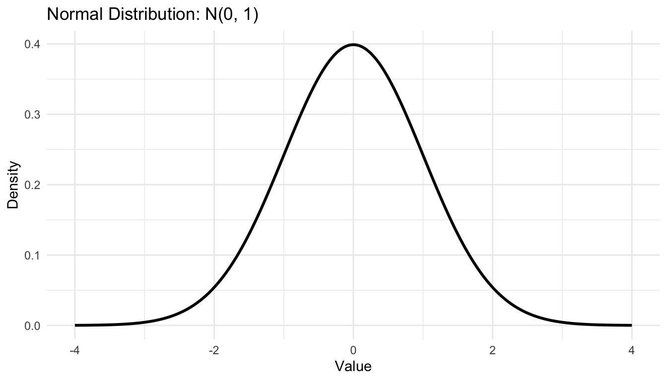
For example, if data are assumed normal, MLE estimates the mean and variance.

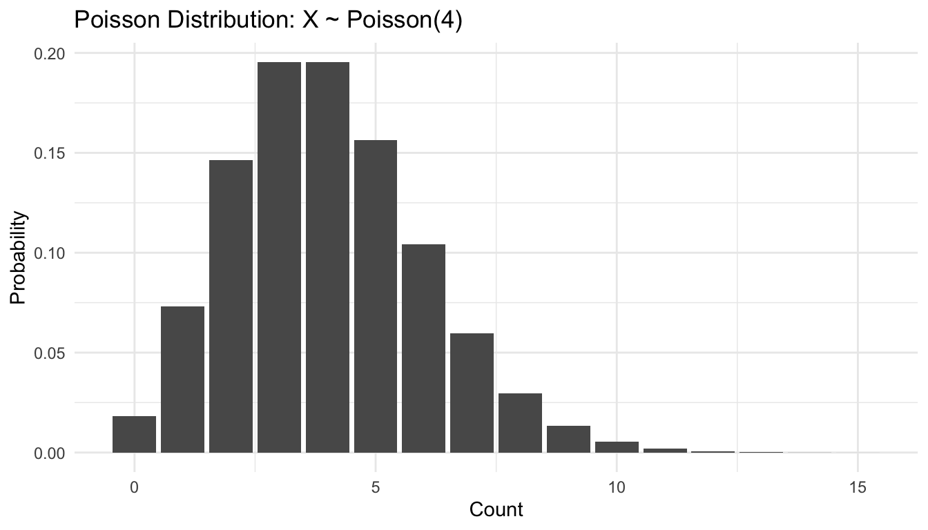
If data are assumed Poisson, MLE estimates the rate parameter \(\lambda\).

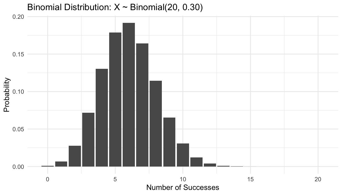
If data are assumed Binomial with known \(n\), MLE estimates the success probability \(p\).

Here is a simple example using simulated Poisson data.

pois_sample <- rpois(500, lambda = 5)

lambda_hat <- mean(pois_sample)

tibble::tibble(
  true_lambda = 5,
  mle_lambda = lambda_hat
)
# A tibble: 1 × 2
  true_lambda mle_lambda
        <dbl>      <dbl>
1           5       5.12

For the Poisson distribution, the sample mean is the MLE for \(\lambda\).

Now a Normal example:

norm_sample <- rnorm(500, mean = 10, sd = 2)

mu_hat <- mean(norm_sample)
sigma_hat <- sqrt(mean((norm_sample - mu_hat)^2))

tibble::tibble(
  parameter = c("mu", "sigma"),
  estimate = c(mu_hat, sigma_hat)
)
# A tibble: 2 × 2
  parameter estimate
  <chr>        <dbl>
1 mu           10.0 
2 sigma         1.91

MLE is a major bridge between classical statistics and machine learning because many training algorithms can be interpreted as likelihood-based optimization.


Transformations Help When Raw Data Do Not Fit Simple Assumptions

Real data do not always match textbook distributions.

One common response is transformation.

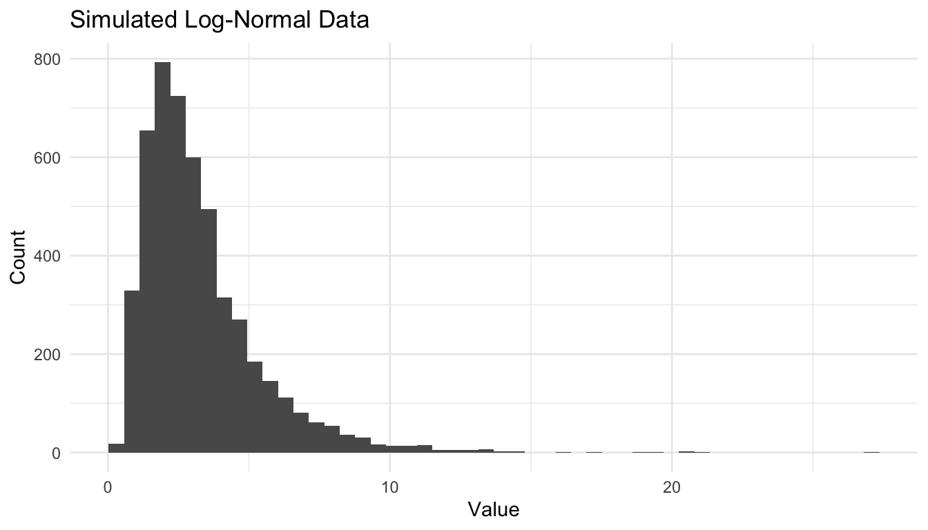
For example, a strongly right-skewed variable may become approximately symmetric after log transformation.

trans_df <- tibble::tibble(
  original = biostats_df$los_like,
  log_value = log(biostats_df$los_like)
)

ggplot2::ggplot(trans_df, ggplot2::aes(x = log_value)) +
  ggplot2::geom_histogram(bins = 40) +
  ggplot2::labs(
    title = "Log-Transformed Positive Skewed Variable",
    x = "log(Value)",
    y = "Frequency"
  ) +
  ggplot2::theme_minimal()

This matters because many modeling methods perform better when assumptions about symmetry, variance stability, or linear structure are more reasonable after transformation.


Simulation Is One of the Best Ways to Learn Distributions

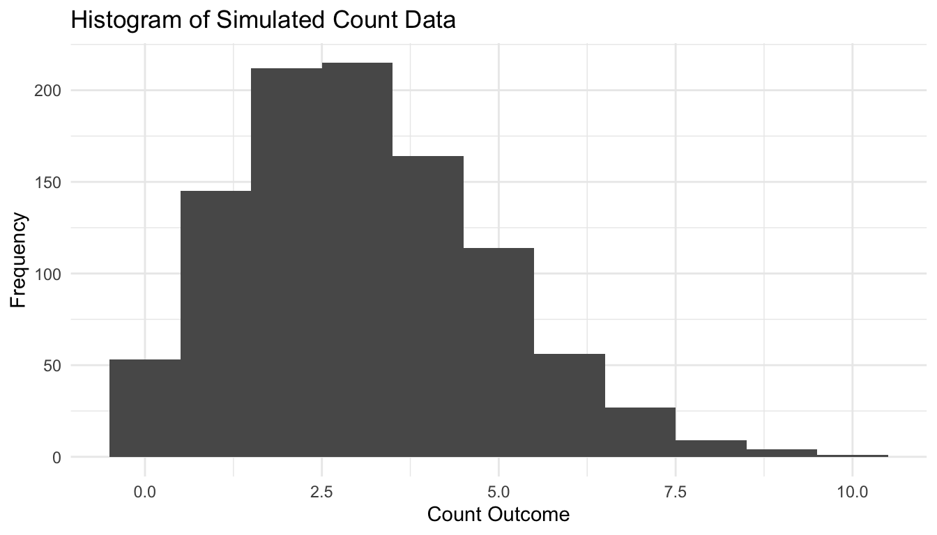
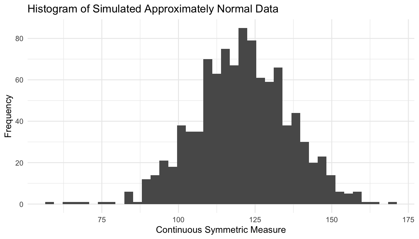
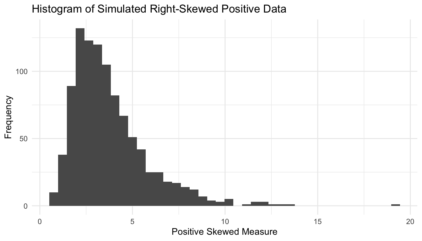
One of the fastest ways to understand a distribution is to simulate from it.

Simulation makes abstract formulas concrete.

Here is a comparison of repeated samples from several common distributions.

sim_compare <- tibble::tibble(
  binomial = rbinom(1000, size = 20, prob = 0.3),
  poisson = rpois(1000, lambda = 4),
  normal = rnorm(1000, mean = 0, sd = 1),
  lognormal = rlnorm(1000, meanlog = 0, sdlog = 0.5)
)

sim_compare |>
  dplyr::summarise(
    mean_binomial = mean(binomial),
    mean_poisson = mean(poisson),
    mean_normal = mean(normal),
    mean_lognormal = mean(lognormal)
  )
# A tibble: 1 × 4
  mean_binomial mean_poisson mean_normal mean_lognormal
          <dbl>        <dbl>       <dbl>          <dbl>
1          6.05         4.02     -0.0290           1.12

Simulation is useful not only for learning, but also for:

  • checking analytic expectations,
  • stress-testing assumptions,
  • explaining uncertainty to stakeholders,
  • and generating synthetic datasets for workflow development.

Distribution Choice Affects Model Fit, Interpretation, and Error Behavior

A poor distributional assumption can distort:

  • parameter estimates,
  • standard errors,
  • prediction intervals,
  • calibration,
  • and interpretation.

For example:

  • fitting a Normal model to highly skewed positive data may yield misleading summaries,
  • fitting a Poisson model to overdispersed counts may underestimate variability,
  • treating bounded probabilities as unbounded continuous outcomes can create incoherent predictions.

This is why distribution choice is not a minor technicality. It is part of responsible modeling.


These Distributions Reappear Throughout AI/ML

Probability distributions are not confined to introductory statistics (Murphy 2012; Wasserman 2004).

They reappear across machine learning in practical ways.

Binomial / Bernoulli

Used in:

  • binary classification,
  • logistic regression,
  • probabilistic calibration,
  • yes/no outcomes.

Poisson

Used in:

  • count regression,
  • rate prediction,
  • event modeling,
  • queueing and operational forecasts.

Normal

Used in:

  • linear regression assumptions,
  • Gaussian generative models,
  • latent variable methods,
  • neural activation approximations.

Log-normal

Used in:

  • positive skewed outcomes,
  • multiplicative processes,
  • time and cost modeling,
  • transformed regression settings.

The details differ, but the core idea remains the same:

a distribution is a statement about uncertainty structure.


A Practical Checklist for Distributional Thinking

Before fitting a model, ask:

  • Is the outcome discrete or continuous?
  • Is it bounded, unbounded, or strictly positive?
  • Is the distribution symmetric or skewed?
  • Are zeros common?
  • Does the variance appear tied to the mean?
  • Would a transformation improve interpretability or fit?
  • Does the chosen distribution match the real data-generating story?

These questions often matter as much as the algorithm itself.

NoteWhere This Shows Up in AI/ML

Distribution shift — the mismatch between the distribution of training data and the distribution encountered at deployment — is the single most common cause of clinical AI failure in real-world settings; a sepsis model trained on a tertiary academic medical center’s patient population follows a very different joint distribution of vitals, labs, and comorbidities than the combat casualty population seen at a deployed Role 2E, and applying it without revalidation produces systematically miscalibrated probabilities. The DoDTR trauma registry captures a distribution of injury patterns, physiologic derangement, and time-to-care that is categorically unlike civilian trauma center data, so any model trained on NTDB and deployed in a military context is operating outside its training distribution from the first patient.


Closing: Data Science Requires More Than Algorithms

It is tempting to think of modeling as mainly an algorithmic exercise.

But before an algorithm can learn, someone must decide what kind of uncertainty the data represent.

That is what probability distributions do.

Binomial, Poisson, Normal, and Log-normal models are not just textbook objects. They are recurring templates for reasoning about proportions, counts, symmetric measurements, and skewed positive outcomes.

Understanding these distributions improves more than technical accuracy. It improves model choice, interpretation, diagnostics, and communication.

Strong data science depends not only on fitting models well, but on choosing the right distributional language for the problem.


Tip📚 Go Deeper: Prediction Modeling Toolkit

This post is part of the Prediction Modeling Toolkit — a companion reference with distributional assumption checks, goodness-of-fit templates, and simulation code for common statistical distributions.

→ Open the Prediction Modeling Toolkit


Series Callout

Note

This post is part of a broader Applied Statistics for AI and Clinical Decision-Making Series:

  • Probability fundamentals for machine learning
  • Random variables and expectation
  • Common probability distributions
  • Central Limit Theorem
  • Law of Large Numbers
  • Sampling methods for Biostats and ML
  • Hypothesis testing in the age of AI
  • Confidence intervals
  • Maximum likelihood estimation
  • Bayesian inference
  • Linear regression
  • Logistic regression
  • Generalized linear models
  • Analysis of variance
  • Principal component analysis
  • Cluster analysis
  • Time series analysis
  • Survival analysis
  • Non-parametric methods
  • Bias-variance tradeoff
  • Regularization
  • Cross-validation
  • Information theory
  • Optimization techniques
  • Linear algebra basics
  • Calculus for ML
  • Monte Carlo methods
  • Dimensionality curse and reduction techniques
  • Model evaluation metrics
  • Ensemble methods

References

DeGroot, Morris H., and Mark J. Schervish. 2012. Probability and Statistics. 4th ed. Pearson.
Murphy, Kevin P. 2012. Machine Learning: A Probabilistic Perspective. MIT Press.
Wasserman, Larry. 2004. All of Statistics: A Concise Course in Statistical Inference. Springer.