It explains why averages become stable, why inference often relies on normal approximations, and why uncertainty becomes easier to summarize as sample sizes grow.
At first glance, the theorem can feel surprising.
It says that even when the underlying data are not normally distributed, the distribution of the sample mean often becomes approximately normal as the sample size increases.
That is a profound result.
It means that:
messy observations can still produce orderly summaries,
irregular data can yield predictable aggregate behavior,
and uncertainty in large samples can often be approximated using normal methods.
This is why the CLT matters far beyond the classroom.
It supports:
hypothesis testing,
confidence intervals,
bootstrap reasoning,
model evaluation,
and many large-scale AI/ML workflows.
The Central Limit Theorem does not make raw data normal. It makes averages behave predictably.
The CLT Explains Why Averages Become Orderly
Real-world data are often noisy, skewed, discrete, bounded, or heavy-tailed.
Individual observations can look chaotic.
But when we take repeated samples and compute their means, something remarkable happens:
the distribution of those sample means becomes more regular as the sample size increases.
That is the core intuition of the CLT.
The theorem does not say every dataset is normal. It says that under broad conditions, the sampling distribution of the mean approaches a normal distribution as \(n\) gets large (Casella and Berger 2002; DeGroot and Schervish 2012).
This matters because many statistical and machine learning workflows depend more on averages, aggregated errors, or average performance metrics than on single raw observations.
What the Central Limit Theorem Actually Says
A simplified version of the CLT is this:
Let \(X_1, X_2, \dots, X_n\) be independent and identically distributed random variables with finite mean \(\mu\) and finite variance \(\sigma^2\).
Then, as \(n\) becomes large,
\[
\frac{\bar{X} - \mu}{\sigma / \sqrt{n}}
\]
approaches a standard normal distribution.
In words:
center the sample mean around the true mean,
scale it by its standard error,
and the result becomes approximately normal as the sample size increases.
This is one reason the normal distribution appears so often in applied work.
It is not only a model for raw data. It is also a model for the behavior of averages.
The CLT Is About Sampling Distributions, Not Raw Data
This is the single most common misunderstanding.
The CLT does not say that the original data become normal.
It says the distribution of the sample mean becomes approximately normal.
That distinction matters.
A highly skewed variable can remain highly skewed. But if we repeatedly draw samples from it and compute the mean of each sample, the histogram of those means becomes increasingly bell-shaped.
So the theorem concerns:
repeated sampling,
repeated averages,
and the behavior of those averages.
It does not magically transform each raw observation.
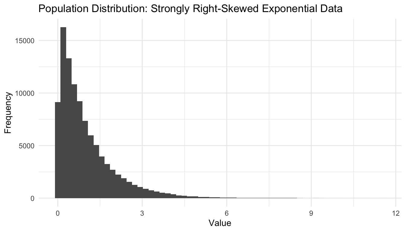
A Simple Simulation Makes the Idea Visible
The easiest way to understand the CLT is to simulate it.
We will begin with a strongly right-skewed population: an exponential distribution.
This is useful because it makes the theorem more visually impressive than if we started with normal data.
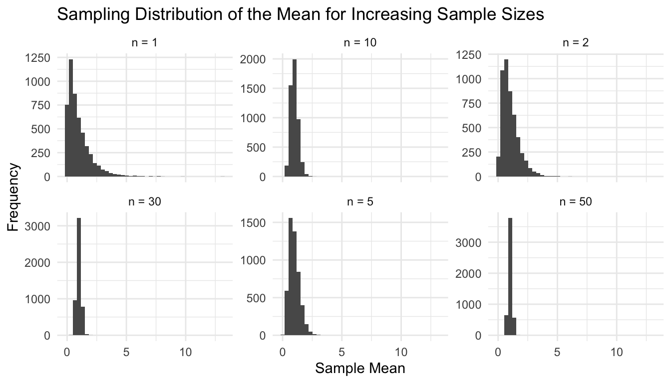
ggplot2::ggplot(clt_df, ggplot2::aes(x = sample_mean)) + ggplot2::geom_histogram(bins =40) + ggplot2::facet_wrap(~ n, scales ="free_y") + ggplot2::labs(title ="Sampling Distribution of the Mean for Increasing Sample Sizes",x ="Sample Mean",y ="Frequency" ) + ggplot2::theme_minimal()
This is the CLT becoming visible.
As \(n\) increases, the sampling distribution of the mean becomes more concentrated and more symmetric.
The CLT Also Explains Why Variability Shrinks with Larger Samples
The CLT is not only about shape. It is also about scale.
Even when the raw data are not exactly normal, the CLT often allows the test statistic or sample mean to be approximated using a normal distribution when sample sizes are sufficiently large.
This is why procedures such as:
z-tests,
approximate t-based reasoning,
large-sample confidence intervals,
and many likelihood-based methods
often work surprisingly well in practice.
The key logic is not that the data are perfect. It is that the sampling behavior of estimators becomes tractable.
A Small Example: Sampling Distribution of a Mean
Suppose the true population mean is 1 for an exponential distribution with rate 1.
We can examine how sample means behave around that value.
The CLT helps justify this structure because it tells us that the sampling distribution of the mean is approximately normal in large samples.
That means we can summarize uncertainty with:
a center,
a standard error,
and a normal or near-normal reference distribution.
Without the CLT, many familiar interval estimates would be much harder to justify.
The CLT Matters in Bootstrapping and Model Evaluation
Modern ML often relies on repeated resampling to estimate performance.
Examples include:
bootstrap estimates of prediction error,
repeated cross-validation,
bagging,
random forests,
and ensemble stability analysis.
The CLT helps explain why averages across many repeated resamples often behave predictably.
Performance summaries such as:
mean AUC,
mean accuracy,
mean calibration slope,
mean loss,
often become easier to analyze because averaged quantities inherit the stabilizing logic of the CLT.
This does not mean every ML metric is perfectly normal. But it does explain why aggregation often creates order out of noisy evaluation results.
The CLT Is One Reason Ensemble Methods Work So Well
Ensemble methods often succeed by averaging across unstable or noisy components.
Random forests are a classic example.
Each tree may be noisy and highly variable. But averaging predictions across many trees produces more stable behavior.
This is not exactly the CLT in its simplest textbook form, but the intuition is related:
averaging reduces noise and makes aggregate behavior more predictable.
That is one reason ensemble systems are often more robust than single learners (Murphy 2012).
The broader message is that aggregation is a statistical strategy, not just a computational trick.
The CLT Has Conditions and Limits
The CLT is powerful, but it is not magic without assumptions.
It generally depends on:
independence or weak dependence,
identical or reasonably regular distributions,
finite variance,
and sufficiently large sample size.
Some important cautions:
very heavy-tailed data may converge slowly,
strong dependence can break the standard result,
small samples may not look normal at all,
skewed populations may require larger \(n\) for a decent approximation.
So the CLT is best understood as an asymptotic result, not a license to ignore diagnostics.
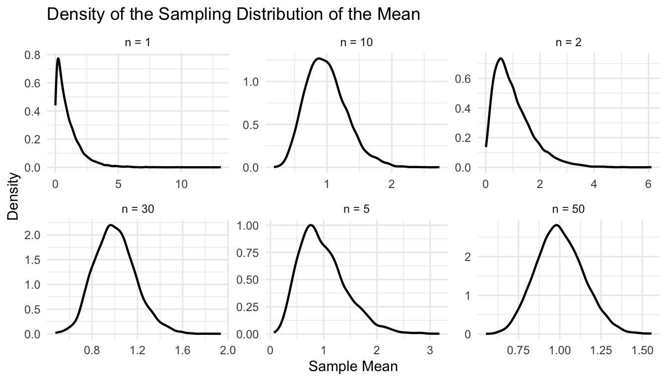
Different Sample Sizes Show Different Degrees of Convergence
A key practical lesson is that “large enough” depends on the problem.
For nearly symmetric data, modest sample sizes may be enough.
For highly skewed or heavy-tailed data, much larger samples may be needed before the normal approximation becomes convincing.
We can compare the sample mean distributions again, this time with density overlays.
ggplot2::ggplot(clt_df, ggplot2::aes(x = sample_mean)) + ggplot2::geom_density(linewidth =0.8) + ggplot2::facet_wrap(~ n, scales ="free") + ggplot2::labs(title ="Density of the Sampling Distribution of the Mean",x ="Sample Mean",y ="Density" ) + ggplot2::theme_minimal()
This makes the convergence even clearer.
Optional Animation: Watching Convergence Happen
One effective way to teach the CLT is through animation.
If you want to render an animated version in Quarto, you can use gganimate.
This kind of animation is especially effective for teaching because it makes the theorem feel dynamic rather than abstract.
The CLT Is Really About Order Emerging from Aggregation
At a higher level, the CLT teaches a broader lesson:
aggregation can produce stability even when individual observations are messy.
That principle appears everywhere:
patient averages,
site-level metrics,
model performance summaries,
ensemble predictions,
repeated-sampling diagnostics.
In this sense, the CLT is more than a theorem. It is a general idea about why summaries can be more predictable than components.
A Practical Checklist for Applied Work
Before relying on normal approximations, ask:
Am I reasoning about raw data or about a sampling distribution?
Is the quantity of interest an average, proportion, or aggregate?
Is the sample size plausibly large enough?
Is the underlying distribution extremely skewed or heavy-tailed?
Would simulation or bootstrap checks help confirm the approximation?
Am I using the CLT to justify a summary appropriately, rather than assuming the raw data are normal?
These questions improve both rigor and communication.
NoteWhere This Shows Up in AI/ML
Stochastic gradient descent — the optimization engine behind virtually every neural network trained today — works because gradients averaged over a mini-batch are approximately normally distributed around the true full-dataset gradient, a direct consequence of the CLT; this is why batch size is not a free hyperparameter but a statistical choice that governs gradient estimate variance, convergence speed, and generalization. When batch sizes are set too small in clinical NLP models fine-tuned on limited EHR data (a common constraint in military health systems with restricted data access), gradient estimates are noisy enough to derail convergence or produce models that memorize rather than generalize.
Closing: The CLT Makes Inference Possible at Scale
The Central Limit Theorem is one of the main reasons uncertainty becomes manageable in applied statistics.
It explains why averages become approximately normal, why larger samples stabilize estimates, and why many inferential tools work even when raw data are imperfect.
That is why the theorem matters not only for introductory statistics, but also for modern machine learning.
It supports:
confidence intervals,
bootstrap logic,
repeated model evaluation,
and the stabilizing power of ensemble methods.
The CLT is one of the great reasons statistics works in practice: it shows how repeated aggregation can turn noise into structure.
This post is part of the Prediction Modeling Toolkit — a companion reference with sampling distribution diagnostics, standard error estimation templates, and CLT-based inference scaffolds.