PCA Demystified: Shrinking Data for Faster AI

Applied Statistics
Principal Component Analysis
An applied introduction to principal component analysis, eigenvalues, loadings, scree plots, and dimensionality reduction for high-dimensional data.
Published

May 15, 2024

Modified

June 9, 2026

Executive Summary

High-dimensional data are everywhere.

In modern analytics, we often encounter datasets with:

  • many biomarkers,
  • many genomic features,
  • many imaging measurements,
  • many sensor variables,
  • or many engineered predictors.

That richness can be valuable, but it also creates problems.

High-dimensional data can be:

  • hard to visualize,
  • computationally expensive,
  • noisy,
  • redundant,
  • and difficult to interpret.

Principal Component Analysis, or PCA, is one of the most important tools for managing that complexity (Pearson 1901; Hotelling 1933; Jolliffe 2002).

PCA reduces dimensionality by finding new variables — called principal components — that capture as much variation in the data as possible using fewer dimensions.

This makes PCA useful for:

  • exploratory data analysis,
  • preprocessing,
  • visualization,
  • noise reduction,
  • and feature compression before modeling.

This post introduces:

  • eigenvalues and eigenvectors,
  • principal components,
  • loadings and scores,
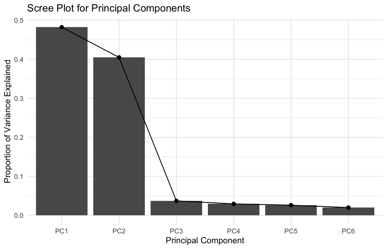
  • scree plots,
  • and interpretation in a genomics-style setting.

PCA matters because many datasets contain more dimensions than real signal, and shrinking the data intelligently can make both analysis and modeling clearer.


PCA Starts with a Practical Problem: Too Many Variables

Many datasets include variables that overlap heavily in the information they contain.

For example, in genomics, multiple gene-expression features may move together because they reflect shared pathways, common regulatory programs, or correlated measurement structure.

In those settings, using every variable directly can be inefficient.

Problems include:

  • redundancy,
  • instability,
  • overfitting risk,
  • and difficulty visualizing patterns.

PCA addresses this by constructing a smaller set of derived variables that summarize the major directions of variation in the data (Hotelling 1933; Jolliffe 2002).

That is why PCA is often one of the first tools analysts reach for in high-dimensional exploratory work.


PCA Finds New Axes That Capture Variation Efficiently

The key idea of PCA is simple:

instead of analyzing the original variables directly, find new orthogonal directions that capture as much variation as possible.

These new directions are the principal components.

The first principal component captures the greatest possible variance. The second captures the greatest remaining variance subject to being orthogonal to the first. The third captures the next greatest remaining variance, and so on.

This means PCA does not merely drop variables. It re-expresses the data in a more efficient coordinate system.

That is one reason PCA is so powerful.

It compresses information without necessarily discarding all structure.


Eigenvalues and Eigenvectors Provide the Mathematics Behind PCA

PCA is often introduced computationally, but the core mathematics come from eigenvalues and eigenvectors (Pearson 1901; Hotelling 1933; Jolliffe 2002).

If we start with the covariance matrix or correlation matrix of the variables, PCA solves an eigen decomposition problem.

In broad terms:

  • eigenvectors define the directions of the principal components
  • eigenvalues tell us how much variance is captured along each direction

This means:

  • eigenvectors describe the orientation of the new axes
  • eigenvalues describe the importance of those axes

For many analysts, this is the conceptual takeaway that matters most:

PCA finds directions in variable space where the data vary most strongly.

That is what dimension reduction is built on.


Standardization Usually Matters Before PCA

A major practical decision in PCA is whether to analyze:

  • the covariance matrix
  • or the correlation matrix

If the variables are measured on very different scales, PCA on the covariance matrix can be dominated by the variables with the largest raw variance.

That is why standardization is often essential.

When variables are centered and scaled, PCA is effectively performed on the correlation structure.

This is especially important in genomics, biomarker, or multi-feature datasets where features may have very different units or measurement ranges.

In most applied settings, if variables are on different scales, standardizing before PCA is the safer default.


A Genomics-Style Example Makes PCA Concrete

To illustrate, we will simulate a small genomics-style dataset with correlated features.

The example is artificial, but it mimics the common structure of multiple correlated measurements across samples.

library(dplyr)
library(tibble)
library(ggplot2)

n_subjects <- 120

latent_1 <- rnorm(n_subjects, mean = 0, sd = 1)
latent_2 <- rnorm(n_subjects, mean = 0, sd = 1)

pca_df <- tibble::tibble(
  sample_id = paste0("S", seq_len(n_subjects)),
  gene_1 =  0.8 * latent_1 + 0.2 * latent_2 + rnorm(n_subjects, 0, 0.4),
  gene_2 =  0.7 * latent_1 + 0.1 * latent_2 + rnorm(n_subjects, 0, 0.4),
  gene_3 =  0.9 * latent_1 - 0.1 * latent_2 + rnorm(n_subjects, 0, 0.4),
  gene_4 = -0.2 * latent_1 + 0.8 * latent_2 + rnorm(n_subjects, 0, 0.4),
  gene_5 = -0.1 * latent_1 + 0.7 * latent_2 + rnorm(n_subjects, 0, 0.4),
  gene_6 =  0.0 * latent_1 + 0.9 * latent_2 + rnorm(n_subjects, 0, 0.4)
)

pca_df |>
  dplyr::select(-sample_id) |>
  dplyr::summarise(dplyr::across(dplyr::everything(), mean))
# A tibble: 1 × 6
  gene_1  gene_2 gene_3  gene_4 gene_5  gene_6
   <dbl>   <dbl>  <dbl>   <dbl>  <dbl>   <dbl>
1 0.0157 -0.0732 -0.123 -0.0165 0.0142 -0.0604

This gives us six correlated features across 120 samples.


Fitting PCA in R Is Straightforward, but Interpretation Is the Real Work

We can run PCA using prcomp().

pca_fit <- prcomp(
  pca_df |> dplyr::select(-sample_id),
  center = TRUE,
  scale. = TRUE
)

summary(pca_fit)
Importance of components:
                          PC1    PC2     PC3     PC4     PC5     PC6
Standard deviation     1.7008 1.5585 0.47262 0.42087 0.39667 0.34714
Proportion of Variance 0.4821 0.4048 0.03723 0.02952 0.02622 0.02008
Cumulative Proportion  0.4821 0.8869 0.92417 0.95369 0.97992 1.00000

The function returns:

  • standard deviations of principal components
  • proportion of variance explained
  • rotation matrix, which contains the loadings
  • scores for each sample on each principal component

Running PCA is easy.

Understanding what the components mean is the real analytical task.


Eigenvalues Tell Us How Much Variance Each Component Explains

In practice, the variance explained by each component is often one of the first summaries analysts inspect.

The component variances are the squared standard deviations from prcomp().

eigen_tbl <- tibble::tibble(
  component = paste0("PC", seq_along(pca_fit$sdev)),
  eigenvalue = pca_fit$sdev^2,
  prop_var = (pca_fit$sdev^2) / sum(pca_fit$sdev^2),
  cum_var = cumsum((pca_fit$sdev^2) / sum(pca_fit$sdev^2))
)

eigen_tbl
# A tibble: 6 × 4
  component eigenvalue prop_var cum_var
  <chr>          <dbl>    <dbl>   <dbl>
1 PC1            2.89    0.482    0.482
2 PC2            2.43    0.405    0.887
3 PC3            0.223   0.0372   0.924
4 PC4            0.177   0.0295   0.954
5 PC5            0.157   0.0262   0.980
6 PC6            0.121   0.0201   1    

These values help answer:

  • how much information does each component retain?
  • how many dimensions are worth keeping?
  • where does the explained variance begin to level off?

That is the logic behind the scree plot.


Scree Plots Help Decide How Many Components Matter

A scree plot shows the variance explained by each principal component.

ggplot2::ggplot(eigen_tbl, ggplot2::aes(x = component, y = prop_var)) +
  ggplot2::geom_col() +
  ggplot2::geom_line(ggplot2::aes(group = 1)) +
  ggplot2::geom_point(size = 2) +
  ggplot2::labs(
    title = "Scree Plot for Principal Components",
    x = "Principal Component",
    y = "Proportion of Variance Explained"
  ) +
  ggplot2::theme_minimal()

Analysts often look for:

  • an “elbow” in the plot
  • strong early components
  • or a cumulative variance threshold

There is no single perfect rule, but the scree plot is one of the most useful practical tools for deciding how aggressively to reduce dimension.


Loadings Tell Us What Each Component Represents

The loadings show how strongly each original variable contributes to a principal component.

These come from the rotation matrix.

loadings_tbl <- as.data.frame(pca_fit$rotation) |>
  tibble::rownames_to_column("variable") |>
  tibble::as_tibble()

loadings_tbl
# A tibble: 6 × 7
  variable    PC1    PC2     PC3     PC4     PC5     PC6
  <chr>     <dbl>  <dbl>   <dbl>   <dbl>   <dbl>   <dbl>
1 gene_1   -0.292 -0.520 -0.0867  0.414   0.467   0.498 
2 gene_2   -0.359 -0.456  0.343  -0.731  -0.0866  0.0612
3 gene_3   -0.453 -0.356 -0.227   0.347  -0.463  -0.531 
4 gene_4    0.460 -0.328  0.550   0.312  -0.484   0.217 
5 gene_5    0.433 -0.362 -0.712  -0.276  -0.239   0.205 
6 gene_6    0.427 -0.397  0.117  -0.0202  0.519  -0.614 

Interpretation idea:

  • variables with large positive or negative loadings on a component are the ones shaping that component most strongly
  • variables with similar signs often move together along that dimension
  • opposite signs can indicate contrast structure

For example, if gene_1, gene_2, and gene_3 all load heavily on PC1, then PC1 may reflect a shared expression pattern across that gene block.

This is one of the most important interpretive steps in PCA.


Scores Tell Us Where Each Observation Lies in Component Space

If loadings describe the variables, scores describe the observations.

Each sample gets a score on each principal component.

scores_tbl <- as.data.frame(pca_fit$x) |>
  tibble::rownames_to_column("row_id") |>
  tibble::as_tibble()

scores_tbl |>
  dplyr::slice_head(n = 10)
# A tibble: 10 × 7
   row_id    PC1    PC2     PC3    PC4      PC5      PC6
   <chr>   <dbl>  <dbl>   <dbl>  <dbl>    <dbl>    <dbl>
 1 1      -1.65  -0.694  0.391   0.760  0.172   -0.0893 
 2 2      -0.487  0.934 -0.0685 -0.223  0.113   -0.436  
 3 3      -0.548 -1.00  -1.39   -0.273  0.382   -0.00165
 4 4       1.05   0.698  0.119  -0.164 -0.212    0.180  
 5 5       2.48   1.60  -0.944  -0.286  0.00566  0.420  
 6 6       1.26  -0.714 -0.266   0.191 -0.357    0.417  
 7 7      -2.94   1.44   0.380   0.570  0.881    0.0651 
 8 8      -0.936  1.12  -0.270   0.645 -0.365    0.395  
 9 9       3.07   0.134  0.956   0.523  0.255    0.0191 
10 10     -0.884  0.238 -0.140   0.105  0.126   -0.470  

The scores are the coordinates of the observations in the reduced-dimensional space.

This is what allows PCA to be used for:

  • low-dimensional visualization
  • clustering exploration
  • compressed feature input into later models

In practice, once the data are projected into PC space, many downstream tasks become easier.


A PC1 vs PC2 Plot Is Often the Most Useful Visualization

A two-dimensional score plot is one of the most common PCA graphics.

We will add a simple subgroup label for illustration.

plot_df <- pca_df |>
  dplyr::mutate(
    subgroup = if_else(row_number() <= n_subjects / 2, "Group 1", "Group 2")
  ) |>
  dplyr::bind_cols(
    as.data.frame(pca_fit$x[, 1:2]) |> tibble::as_tibble()
  )
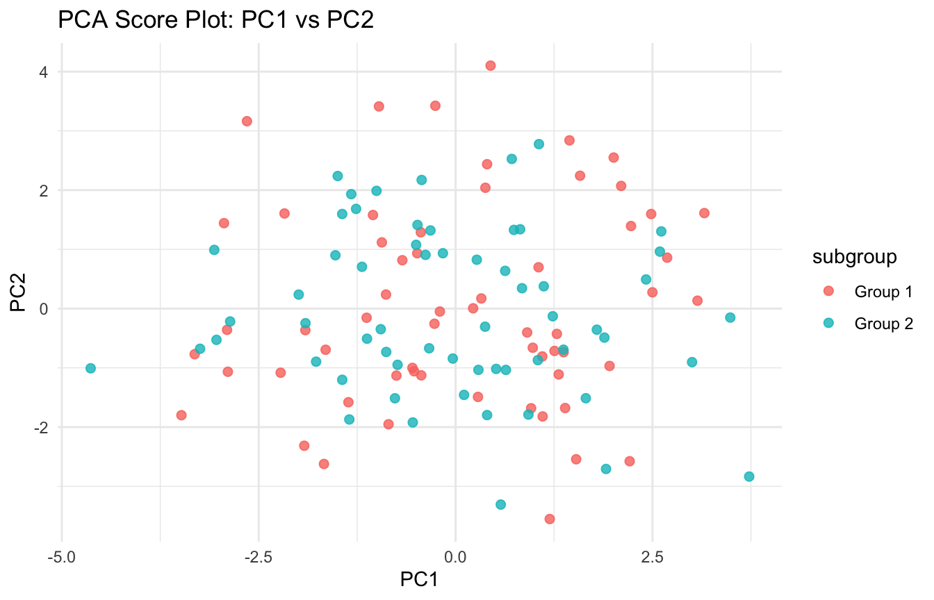
ggplot2::ggplot(plot_df, ggplot2::aes(x = PC1, y = PC2, color = subgroup)) +
  ggplot2::geom_point(size = 2, alpha = 0.8) +
  ggplot2::labs(
    title = "PCA Score Plot: PC1 vs PC2",
    x = "PC1",
    y = "PC2"
  ) +
  ggplot2::theme_minimal()

This plot can reveal:

  • clustering
  • separation
  • outliers
  • or gradients across samples

That is one reason PCA is so widely used in genomics, omics, and other high-dimensional exploratory workflows.


PCA Is a Dimension Reduction Method, Not a Supervised Model

One of the most important conceptual boundaries is that PCA is unsupervised.

It does not use the outcome variable when constructing components.

That means PCA finds directions of maximal variation, not directions of maximal prediction.

This distinction matters.

A component that explains a lot of variance is not automatically the most predictive of a downstream outcome.

So PCA is often useful for preprocessing or exploration, but not every principal component will necessarily improve predictive performance.

This is an important caution in AI/ML workflows.


PCA Can Help with Speed, Noise Reduction, and Multicollinearity

Despite its limits, PCA is often very useful in practice.

Benefits include:

  • reducing the number of input dimensions
  • compressing correlated variables
  • mitigating multicollinearity
  • improving computational efficiency
  • denoising feature space

These benefits are especially relevant when:

  • predictors are highly correlated
  • there are more features than are easy to model directly
  • training time matters
  • visualization is otherwise impossible

This is why PCA often appears early in high-dimensional workflows.


PCA Loadings Need Interpretation, Not Just Computation

A common mistake is to run PCA, keep the first few components, and stop there.

But PCA only becomes scientifically useful when the components are interpreted thoughtfully.

Questions to ask include:

  • which variables load strongly on this component?
  • does the pattern suggest a biological or operational theme?
  • does the component reflect signal, batch structure, scale artifacts, or noise?
  • are positive and negative loadings substantively meaningful?

This is especially important in genomics and biomarker work, where latent structure may reflect real biology, but may also reflect preprocessing or measurement effects.


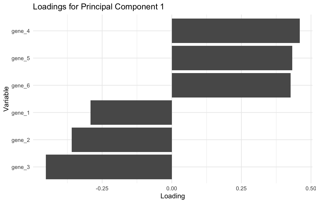
A Simple Loadings Plot Can Help with Interpretation

One helpful way to inspect loadings is with a bar chart.

pc1_loadings_df <- tibble::tibble(
  variable = rownames(pca_fit$rotation),
  loading = pca_fit$rotation[, 1]
)

ggplot2::ggplot(pc1_loadings_df, ggplot2::aes(x = reorder(variable, loading), y = loading)) +
  ggplot2::geom_col() +
  ggplot2::coord_flip() +
  ggplot2::labs(
    title = "Loadings for Principal Component 1",
    x = "Variable",
    y = "Loading"
  ) +
  ggplot2::theme_minimal()

This helps identify the variables driving the first component and whether the component looks like a shared signal or a contrast between sets of variables.


PCA Connects Naturally to AI/ML Preprocessing

PCA remains important in AI/ML because it is one of the classic tools for reducing feature space before modeling.

Common uses include:

  • preprocessing before clustering
  • reducing predictors before regression or classification
  • improving runtime
  • reducing noise in correlated features
  • creating compact latent representations

Even though more advanced methods now exist, PCA still matters because it is:

  • fast
  • interpretable
  • stable
  • and easy to explain

That makes it a valuable baseline dimensionality reduction method.


PCA Is Also a Gateway to More Advanced Representation Learning

Conceptually, PCA is important because it introduces the broader idea of representation learning.

Instead of working directly with raw variables, we learn a transformed representation of the data.

This connects naturally to later topics such as:

  • factor analysis
  • singular value decomposition
  • manifold learning
  • t-SNE and UMAP
  • autoencoders
  • latent embedding methods

PCA is simpler than these methods, but it teaches the central logic clearly:

find a lower-dimensional representation that preserves useful structure.

That is one reason it remains such an important teaching tool.


PCA Has Limits and Should Not Be Overinterpreted

PCA is useful, but it is not magic.

Important limitations include:

  • components may be hard to interpret
  • variance is not the same as predictive importance
  • PCA is sensitive to scaling choices
  • strong outliers can distort components
  • linear components may miss nonlinear structure

This means PCA should be used thoughtfully.

It is a powerful exploratory and preprocessing tool, but not always the final modeling answer.

In some problems, nonlinear manifold methods or supervised dimension reduction may be more appropriate.


A Practical Checklist for Applied Work

Before using PCA, ask:

  • Are the variables on comparable scales, or do they need standardization?
  • Is the goal visualization, denoising, compression, or preprocessing?
  • How much variance do the first few components actually explain?
  • Are the component loadings interpretable?
  • Could batch effects or outliers be driving the dominant components?
  • Does the reduced representation preserve structure that matters for the downstream task?
  • Am I mistaking high variance for predictive relevance?

These questions greatly improve how PCA is used and explained.


NoteWhere This Shows Up in AI/ML

In EHR-based clinical risk modeling, PCA is routinely used to compress correlated lab values — sodium, chloride, and bicarbonate rarely carry independent predictive signal — before fitting logistic or Cox models, reducing effective dimensionality and multicollinearity simultaneously. The word embeddings in large language models like GPT-4 are a learned, nonlinear generalization of exactly this idea: high-dimensional token co-occurrence space is compressed into a dense lower-dimensional representation that preserves semantic structure. The failure mode comes from skipping PCA when it matters: in DoDTR injury-severity feature sets with 40+ correlated anatomic and physiologic variables, analysts who feed all raw features directly into a logistic model often produce unstable coefficients and inflated variance estimates that make replication across deployment cohorts unreliable. PCA-derived components do not replace clinical interpretation — a component that explains 30% of variance may reflect a documentation artifact rather than a real injury phenotype.

Closing: PCA Makes High-Dimensional Data More Manageable

Principal Component Analysis remains important because it provides one of the clearest and most practical ways to reduce dimensionality.

It helps analysts:

  • summarize correlated variables
  • visualize large feature spaces
  • reduce noise
  • and build more efficient preprocessing pipelines

It also teaches deeper ideas about representation, variance, and latent structure that carry forward into more advanced AI/ML methods.

PCA matters because not every variable deserves its own dimension, and learning how to compress data without losing too much structure is one of the core skills of modern analytics.


Tip📚 Go Deeper: Prediction Modeling Toolkit

This post is part of the Prediction Modeling Toolkit — a companion reference with PCA pre-processing templates, scree plot diagnostics, and dimensionality reduction scaffolds for clinical prediction models.

→ Open the Prediction Modeling Toolkit


Series Callout

Note

This post is part of a broader Applied Statistics for AI and Clinical Decision-Making Series:

  • Probability fundamentals for machine learning
  • Random variables and expectation
  • Common probability distributions
  • Central Limit Theorem
  • Law of Large Numbers
  • Sampling methods for Biostats and ML
  • Hypothesis testing in the age of AI
  • Confidence intervals
  • Maximum likelihood estimation
  • Bayesian inference
  • Linear regression
  • Logistic regression
  • Generalized linear models
  • Analysis of variance
  • Principal component analysis
  • Cluster analysis
  • Time series analysis
  • Survival analysis
  • Non-parametric methods
  • Bias-variance tradeoff
  • Regularization
  • Cross-validation
  • Information theory
  • Optimization techniques
  • Linear algebra basics
  • Calculus for ML
  • Monte Carlo methods
  • Dimensionality curse and reduction techniques
  • Model evaluation metrics
  • Ensemble methods

References

Hotelling, Harold. 1933. “Analysis of a Complex of Statistical Variables into Principal Components.” Journal of Educational Psychology 24 (6): 417–41.
Jolliffe, Ian T. 2002. Principal Component Analysis. 2nd ed. Springer.
Pearson, Karl. 1901. “On Lines and Planes of Closest Fit to Systems of Points in Space.” The London, Edinburgh, and Dublin Philosophical Magazine and Journal of Science 2 (11): 559–72. https://doi.org/10.1080/14786440109462720.