# Simulate: policy change at month 24 reduces outcome
n_months <- 48; change_pt <- 24
df_its <- tibble(
  month    = 1:n_months,
  post     = as.integer(month > change_pt),
  time_after = pmax(0, month - change_pt),
  # Pre-period: upward trend; post: level shift down + slope change
  outcome  = 60 + 0.4*month - 15*post - 0.5*time_after + rnorm(n_months, 0, 3)
)

# Segmented regression
fit_its <- lm(outcome ~ month + post + time_after, data=df_its)
df_its$fitted <- fitted(fit_its)

ggplot(df_its, aes(month, outcome)) +
  geom_point(color="#64748b", size=2, alpha=0.7) +
  geom_line(aes(y=fitted), color="#0891b2", linewidth=1.4) +
  geom_vline(xintercept=change_pt + 0.5, linetype=2, color="#e63946", linewidth=1) +
  annotate("text", x=change_pt+1.5, y=72, label="Protocol\nchange",
           color="#e63946", size=3.5, hjust=0) +
  labs(title="Interrupted time series: level shift + slope change after policy implementation",
       x="Month", y="Outcome rate") +
theme_di()Quasi-Experimental Designs & Design Strategy
Design of Experiments — Lecture 4 of 4
2026-01-01
ITS: The Logic
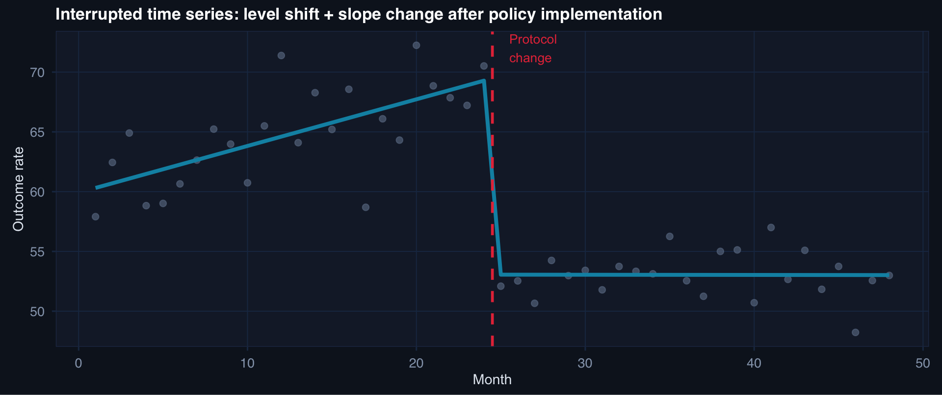
ITS detects two types of effect: an immediate level shift (step change) and a slope change (trajectory change). Both can be estimated simultaneously with segmented regression.
DiD: The Core Idea
# Treated and control groups, pre/post policy
df_did <- tibble(
  time  = rep(c("Pre","Post"), each=2),
  group = rep(c("Treated","Control"), 2),
  mean  = c(55, 50, 45, 48)   # treated drops 10, control drops 2
) |> mutate(
  time = factor(time, levels=c("Pre","Post")),
  counterfactual = c(NA, NA, NA, 55 - (50-48))  # what treated would have been
)

ggplot(df_did, aes(time, mean, group=group, color=group)) +
  geom_line(linewidth=1.4) +
  geom_point(size=5) +
  # Counterfactual dashed line for treated
  geom_segment(aes(x="Pre", xend="Post", y=55, yend=53),
               linetype=2, color="#0891b2", linewidth=1, inherit.aes=FALSE) +
  annotate("text", x=2.05, y=53, label="Counterfactual\n(if no treatment)",
           color="#0891b2", size=3.2, hjust=0) +
  annotate("segment", x=2, xend=2, y=45, yend=53,
           arrow=arrow(length=unit(0.2,"cm"), ends="both"), color="#f59e0b", linewidth=1) +
  annotate("text", x=2.05, y=49, label="DiD\nestimate", color="#f59e0b", size=3.5, hjust=0) +
  scale_color_manual(values=c("#94a3b8","#e63946")) +
  labs(title="DiD: treated group − control group trend = causal effect",
       x=NULL, y="Outcome mean", color=NULL) +
  theme_di()
\[\hat\delta_{DiD} = (\bar{Y}^{Treated}_{Post} - \bar{Y}^{Treated}_{Pre}) - (\bar{Y}^{Control}_{Post} - \bar{Y}^{Control}_{Pre})\]
The Parallel Trends Assumption
n_months <- 36; change <- 18
df_pt <- tibble(
  month = rep(1:n_months, 2),
  group = rep(c("Treated","Control"), each=n_months),
  post  = as.integer(month > change)
) |> mutate(
  # Parallel pre-trends, diverge post
  outcome = case_when(
    group=="Control"  ~ 50 + 0.3*month + rnorm(n_months, 0, 2),
    group=="Treated" & post==0 ~ 55 + 0.3*month + rnorm(n_months, 0, 2),
    group=="Treated" & post==1 ~ 55 + 0.3*change + (month-change)*(0.3-0.5) - 8 + rnorm(n_months, 0, 2)
  )
)

ggplot(df_pt, aes(month, outcome, color=group)) +
  geom_line(linewidth=1.1) +
  geom_smooth(data=filter(df_pt, month<=change), method="lm", se=FALSE,
              linewidth=0.7, linetype=3) +
  geom_vline(xintercept=change, linetype=2, color="#94a3b8") +
  scale_color_manual(values=c("#94a3b8","#e63946")) +
  labs(title="Parallel pre-trends (dotted) support DiD validity — test this, don't assume it",
       x="Month", y="Outcome", color=NULL) +
  theme_di()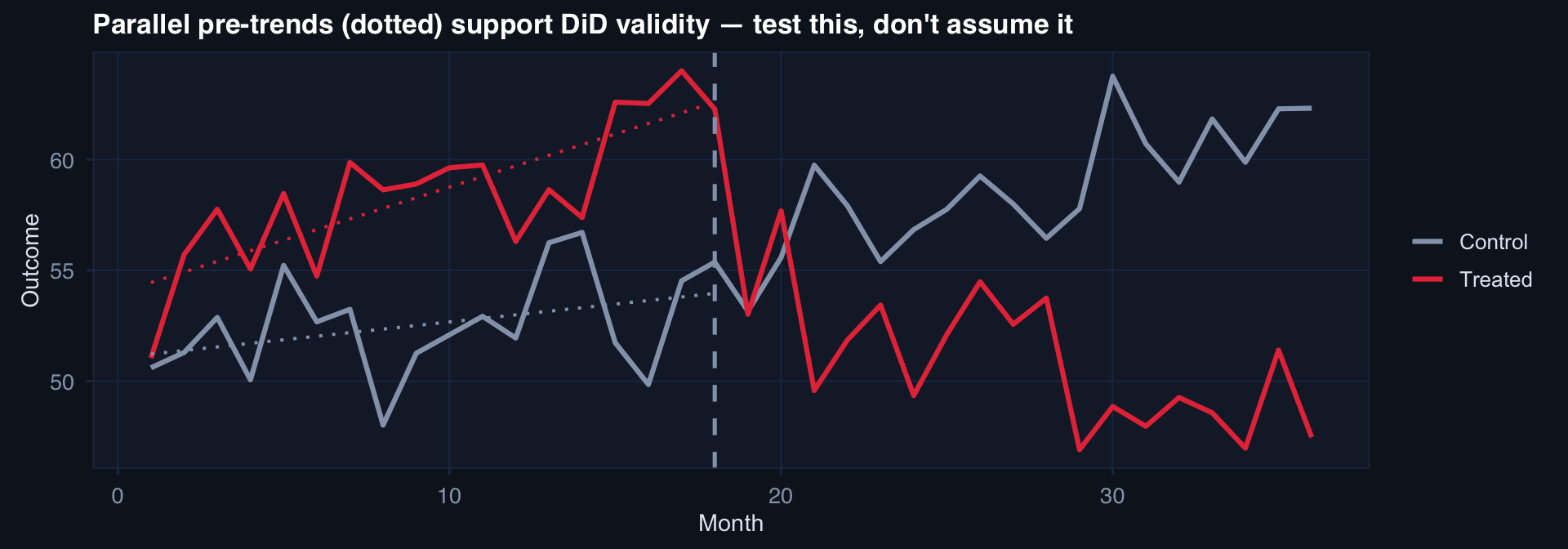
Parallel trends assumption: in the absence of the intervention, treated and control groups would have followed the same trajectory. Not testable post-intervention — but pre-intervention trend similarity is evidence (not proof).
# Regression discontinuity: ISS threshold at 25
n <- 500
df_rd <- tibble(
  iss     = runif(n, 10, 45),
  treated = as.integer(iss >= 25),
  outcome = 20 - 0.3*iss - 4*treated + rnorm(n, 0, 3)
)

ggplot(df_rd, aes(iss, outcome)) +
  geom_point(aes(color=factor(treated)), alpha=0.4, size=1.5) +
  geom_smooth(data=filter(df_rd, iss < 25),  method="lm", se=TRUE,
              color="#2563eb", fill="#2563eb", alpha=0.2) +
  geom_smooth(data=filter(df_rd, iss >= 25), method="lm", se=TRUE,
              color="#e63946", fill="#e63946", alpha=0.2) +
  geom_vline(xintercept=25, linetype=2, color="#f59e0b", linewidth=1) +
  scale_color_manual(values=c("#2563eb","#e63946"),
                     labels=c("Control (ISS < 25)","Treated (ISS ≥ 25)")) +
  labs(title="Regression discontinuity: gap at ISS = 25 estimates the local average treatment effect",
       x="ISS (running variable)", y="Outcome", color=NULL) +
  theme_di()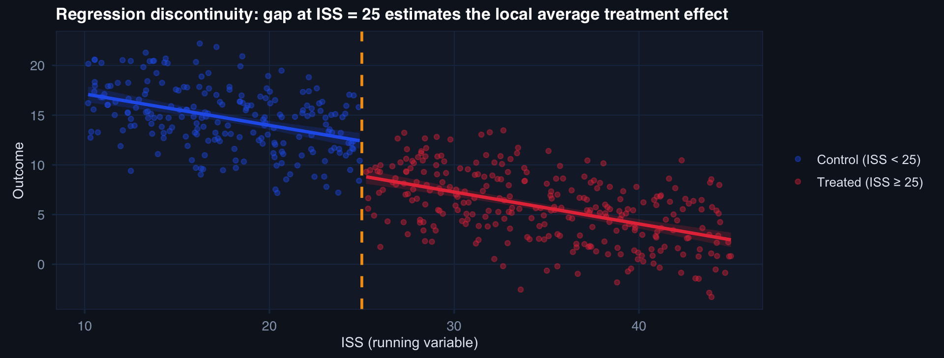
The discontinuity at ISS = 25 estimates the LATE — the causal effect for patients near the threshold. Not the average effect for all patients.
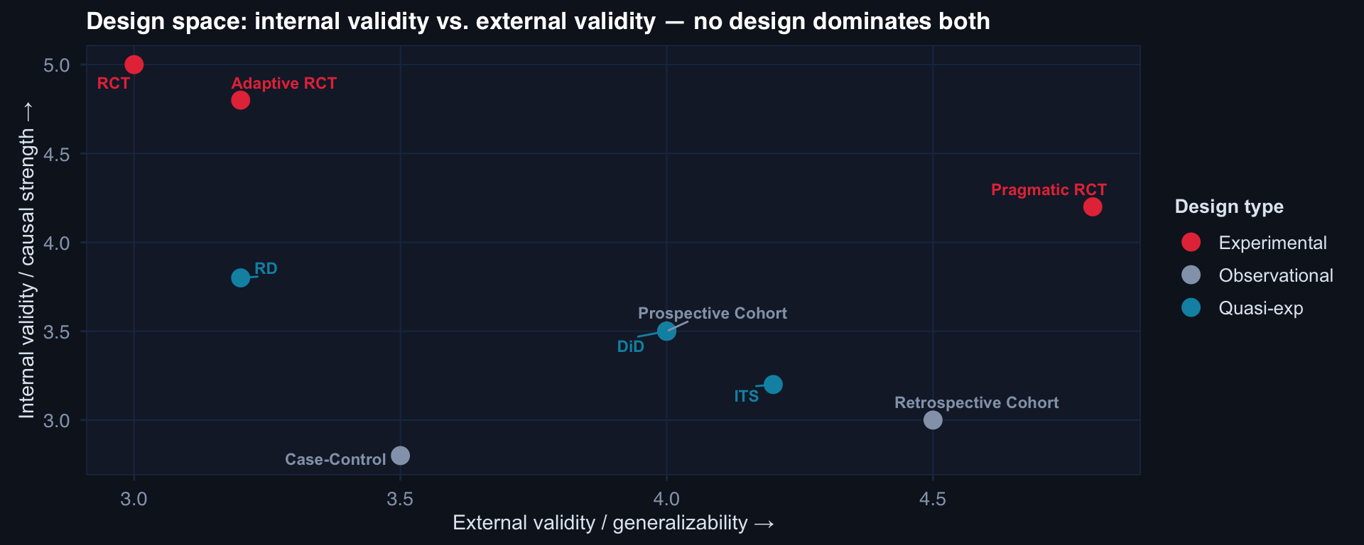
The Design Decision Framework