The Laws That Make Statistics Work

Applied Statistics for AI & Clinical Decision-Making — Lecture 2 of 10

Jonathan D. Stallings, PhD, MS

Data InDeed | dataindeed.org

2026-01-01

We make inferences from samples.

Three laws explain why that works.

What You’ll Learn Today

Three posts · One lecture · ~50 minutes

Post 4 The CLT

  • Why sample means go Normal
  • Convergence demos
  • Why n=30 is a starting point, not a rule

Post 5 The Law of Large Numbers

  • Weak vs. strong LLN
  • Convergence in practice
  • When n is never large enough

Post 6 Mastering Sampling

  • SRS, stratified, cluster
  • Sampling bias
  • Sample size planning

Part 1

The Central Limit Theorem

Why the Normal distribution is everywhere

The CLT: The Single Most Important Result in Statistics

Central Limit Theorem: The sample mean \(\bar{X}_n\) of \(n\) i.i.d. random variables with mean \(\mu\) and variance \(\sigma^2\) converges in distribution to \(N(\mu, \sigma^2/n)\) as \(n \to \infty\).

What this means:

  • The original data doesn’t have to be Normal
  • Averages of any distribution become Normal with enough data
  • This is why so many test statistics have known Normal distributions

The practical implication:

We can use Normal-based inference (t-tests, confidence intervals, z-scores) even when the underlying data is skewed, bimodal, or strange-looking.

Why this matters for registry analytics:

ISS scores, transfusion counts, and time-to-OR are all right-skewed.

But the mean ISS from a sample of 50+ patients behaves approximately Normal — which is why our standard errors and confidence intervals are valid.

Watching the CLT Work: Exponential Data

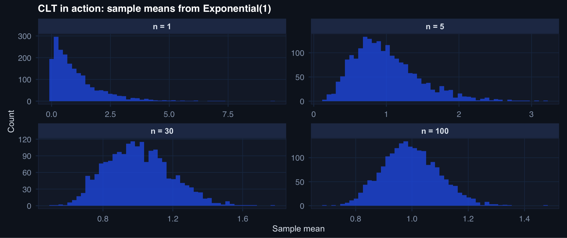
sim_means <- function(n, reps = 2000) {
  replicate(reps, mean(rexp(n, rate = 1))) |>
    tibble::tibble(mean_val = _) |>
    dplyr::mutate(n = n)
}

clt_df <- purrr::map_dfr(c(1, 5, 30, 100), sim_means)

ggplot2::ggplot(clt_df, ggplot2::aes(x = mean_val)) +
  ggplot2::geom_histogram(bins = 50, fill = "#2563eb", alpha = 0.75) +
  ggplot2::facet_wrap(~n, scales = "free",
                      labeller = ggplot2::labeller(n = ~ paste0("n = ", .x))) +
  ggplot2::labs(title = "CLT in action: sample means from Exponential(1)",
                x = "Sample mean", y = "Count") +
  theme_di()

The Standard Error: How Precision Grows with n

\[\text{SE}(\bar{X}) = \frac{\sigma}{\sqrt{n}}\]

Key insight: Precision improves with the square root of sample size.

tibble::tibble(n = 1:500, se = 15 / sqrt(1:500)) |>
  ggplot2::ggplot(ggplot2::aes(x = n, y = se)) +
  ggplot2::geom_line(linewidth = 1.2, color = "#2563eb") +
  ggplot2::geom_vline(xintercept = c(30, 100, 200), linetype = 2, color = "#e63946") +
  ggplot2::labs(title = "Standard Error vs. Sample Size (σ = 15)",
                x = "n", y = "Standard Error") +
  theme_di()

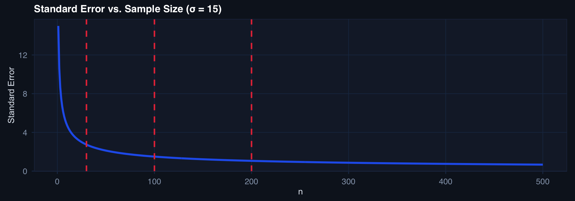
Going from n=50 to n=200 only halves the SE. Quadrupling n for half the precision — this matters for study planning.

When n=30 Is Not Enough

The “n=30 rule” is a teaching shorthand, not a clinical standard.

The CLT convergence depends on:

  • Skewness — more skew needs larger n
  • Kurtosis — heavy tails need larger n
  • The quantity of interest — means converge faster than extremes
  • Multiple comparisons — each additional test erodes the Normal approximation

In practice: For skewed outcomes like ISS, transfusion volume, or ICU LOS, n=30 is the minimum starting point for mean-based inference — not a guarantee.

Registry implication:

When your cohort has 30 patients with a rare injury mechanism, your mean estimates are questionable and your tail estimates (90th percentile mortality) are unreliable.

Report uncertainty honestly.

Part 2

The Law of Large Numbers

Why more data converges to truth

LLN: The Foundation of Empirical Learning

Weak LLN: \(\bar{X}_n \xrightarrow{p} \mu\) as \(n \to \infty\)

The sample mean converges in probability to the population mean.

In plain language: With enough data, your empirical estimate gets arbitrarily close to the true parameter.

This is why machine learning works:

  • With enough training examples, empirical risk approaches true risk
  • With enough registry patients, observed mortality approximates true mortality
  • With enough CPG observations, compliance rate converges to the true rate

Watching the LLN Converge

set.seed(42)
n_max <- 2000
x <- rbinom(n_max, size = 1, prob = 0.27)  # 27% mortality

lln_df <- tibble::tibble(
  n    = 1:n_max,
  cumulative_mean = cumsum(x) / (1:n_max)
)

ggplot2::ggplot(lln_df, ggplot2::aes(x = n, y = cumulative_mean)) +
  ggplot2::geom_line(linewidth = 0.7, color = "#2563eb") +
  ggplot2::geom_hline(yintercept = 0.27, linetype = 2, color = "#e63946", linewidth = 1) +
  ggplot2::annotate("text", x = 1600, y = 0.285, label = "True rate = 0.27",
                    color = "#e63946", size = 3.5) +
  ggplot2::labs(title = "LLN: Cumulative mean converging to true mortality rate",
                x = "Patients observed", y = "Running mortality rate") +
  theme_di()

When the LLN Is Slow

Problem cases where large n is required:

  • Heavy-tailed distributions (e.g., ICU LOS outliers)
  • Rare subgroups (pediatric blast injury, LVAD patients)
  • Non-stationary processes (outcomes changing over time as practice evolves)
  • Dependent observations (patients at the same facility)

Registry reality:

LLN assumes i.i.d. observations.

Trauma registries have:

  • Clustering by facility
  • Case-mix shift over time
  • Selective missingness

The LLN still holds eventually — but n=200 from one site is not the same as n=200 from 20 sites.

Part 3

Mastering Sampling

Getting the right data in the first place

Why Sampling Strategy Is Upstream of Everything

Bad sampling → all downstream analysis is wrong

The data you have reflects how it was collected, not just the population.

Simple Random Sampling (SRS)

  • Every unit has equal probability
  • Unbiased but can undersample rare groups
  • Works well with homogeneous populations

Stratified Sampling

  • Divide population into strata, sample within each
  • Guarantees representation of rare groups
  • Better precision for subgroup estimates

Cluster Sampling

  • Sample clusters (e.g., hospitals), observe all within
  • Cost-efficient for geographically dispersed populations
  • Observations within clusters are correlated → inflate SE

Convenience Sampling

  • Use what’s available
  • Fast but potentially severely biased
  • Most registry data starts here

Sampling Bias: The Silent Distortion

Survivorship bias in trauma registries:

# Simulate: true mortality includes prehospital deaths not in registry
n <- 1000
df <- tibble::tibble(
  severity = rnorm(n, 35, 15),  # ISS proxy
  survived_to_hospital = severity < 75  # prehospital death if ISS > 75
) |>
  dplyr::mutate(
    in_registry = survived_to_hospital,
    died_in_hospital = dplyr::if_else(in_registry, severity > 55, NA)
  )

tibble::tibble(
  Population  = mean(df$severity),
  In_Registry = mean(df$severity[df$in_registry]),
  Difference  = mean(df$severity) - mean(df$severity[df$in_registry])
)
# A tibble: 1 × 3
  Population In_Registry Difference
       <dbl>       <dbl>      <dbl>
1       34.9        34.8     0.0946

The registry systematically excludes the most severely injured patients who die before reaching care. Any mortality model trained only on registry patients will underestimate true mortality for high-ISS injuries.

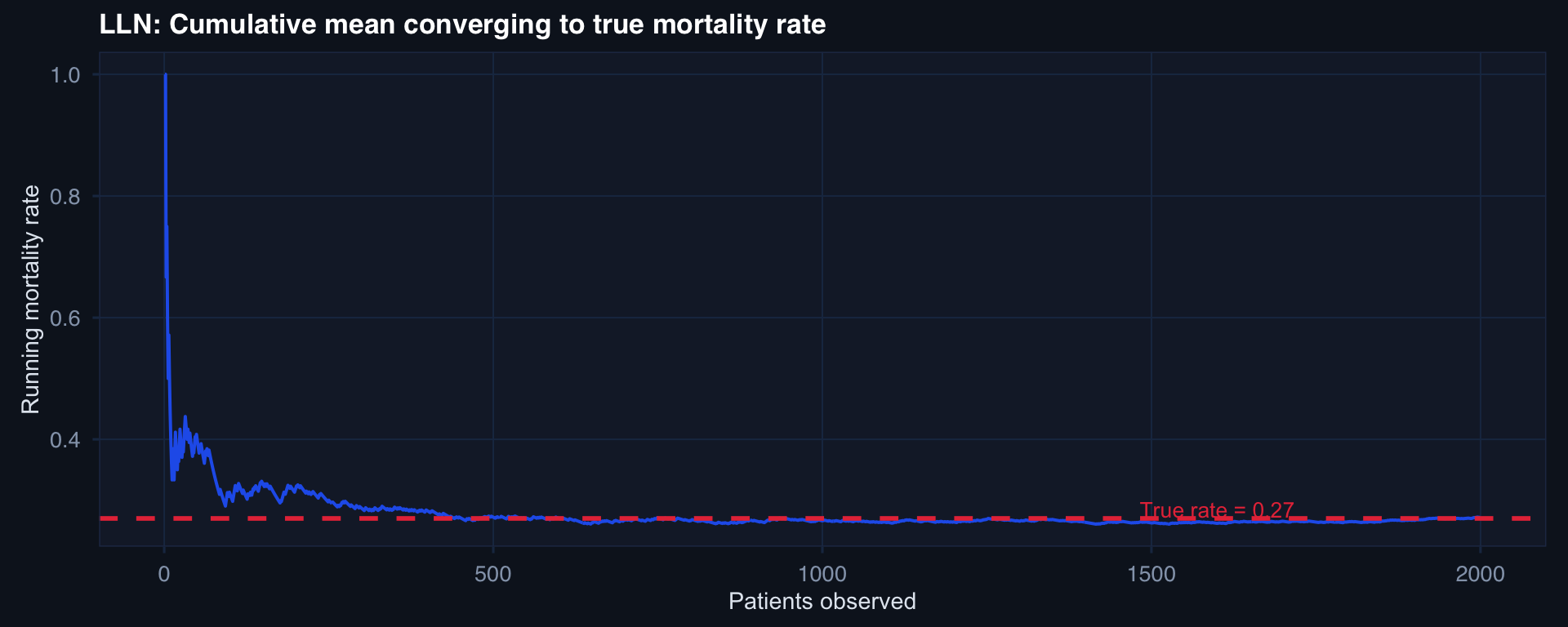
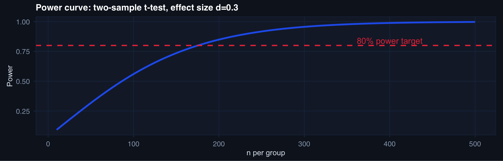
Sample Size Planning: The Four Inputs

\[n \approx \frac{(z_{\alpha/2} + z_\beta)^2 \cdot 2\sigma^2}{\delta^2}\]

where \(\delta\) = minimum detectable difference, \(\sigma^2\) = variance, \(\alpha\) = Type I error rate, \(\beta\) = Type II error rate

# base R power.t.test — no extra packages needed
n_seq <- seq(10, 500, by = 5)
power_df <- tibble::tibble(
  n   = n_seq,
  pwr = sapply(n_seq, function(n) {
    power.t.test(n = n, delta = 0.3, sd = 1,
                 sig.level = 0.05, type = "two.sample")$power
  })
)

ggplot2::ggplot(power_df, ggplot2::aes(x = n, y = pwr)) +
  ggplot2::geom_line(linewidth = 1.2, color = "#2563eb") +
  ggplot2::geom_hline(yintercept = 0.80, linetype = 2, color = "#e63946") +
  ggplot2::annotate("text", x = 400, y = 0.84, label = "80% power target",
                    color = "#e63946") +
  ggplot2::labs(title = "Power curve: two-sample t-test, effect size d=0.3",
                x = "n per group", y = "Power") +
  theme_di()

Lecture 2 — Key Takeaways

CLT

  • Sample means converge to Normal for large n
  • SE = σ/√n — precision grows slowly
  • n=30 is a minimum, not a guarantee
  • Works for means; tail quantities need more care

LLN

  • Empirical estimates converge to true values
  • Requires i.i.d. observations — check your assumptions
  • Clustering and time-varying processes slow convergence

Sampling

  • Strategy is upstream of all inference
  • Stratified sampling protects rare subgroups
  • Survivorship bias is structural in trauma registries
  • Sample size planning: effect size, variance, power, alpha

The meta-lesson: These three results are why statistics can produce reliable inference from limited, imperfect data — when assumptions are met.

Coming Up: Lecture 3

Inference — Estimating and Testing from Data

Posts 07, 08, 09:

  • Hypothesis testing — what p-values actually mean (and don’t mean)
  • Confidence intervals — the honest way to report estimation uncertainty
  • Maximum Likelihood Estimation — the unifying framework behind most models

Statistical inference is not just about getting a p-value. It’s about honestly characterizing what your data tells you — and what it doesn’t.

Resources

Blog posts for this lecture:

Series toolkit:

Data InDeed: